This was my first year where I worked entirely as a professional cartographer.
Here are some of my favorite projects and snippets over the past year.
January
This month was all Story Maps, Story Maps, Story Maps.
Woodwell Climate Research Center was engaged in a longterm project to produce Story Maps on climate and strategic risk in hotspots around the world, each of which needed over a dozen figures and 2-3x as many photos, quotes, videos, and audio snippets.
Navigating the political situation alone was a monumental task. I initially bit off more than I could chew, and my early draft text and figure ideas were (putting it gently) ripped apart for innaccuracies and mischaracterizations. It was a excellent way to be forced to put my own pride aside and focus on telling the story that the experts wanted to tell.
February
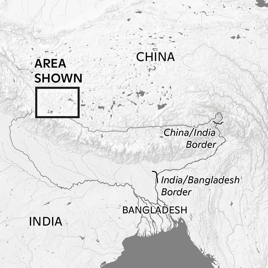
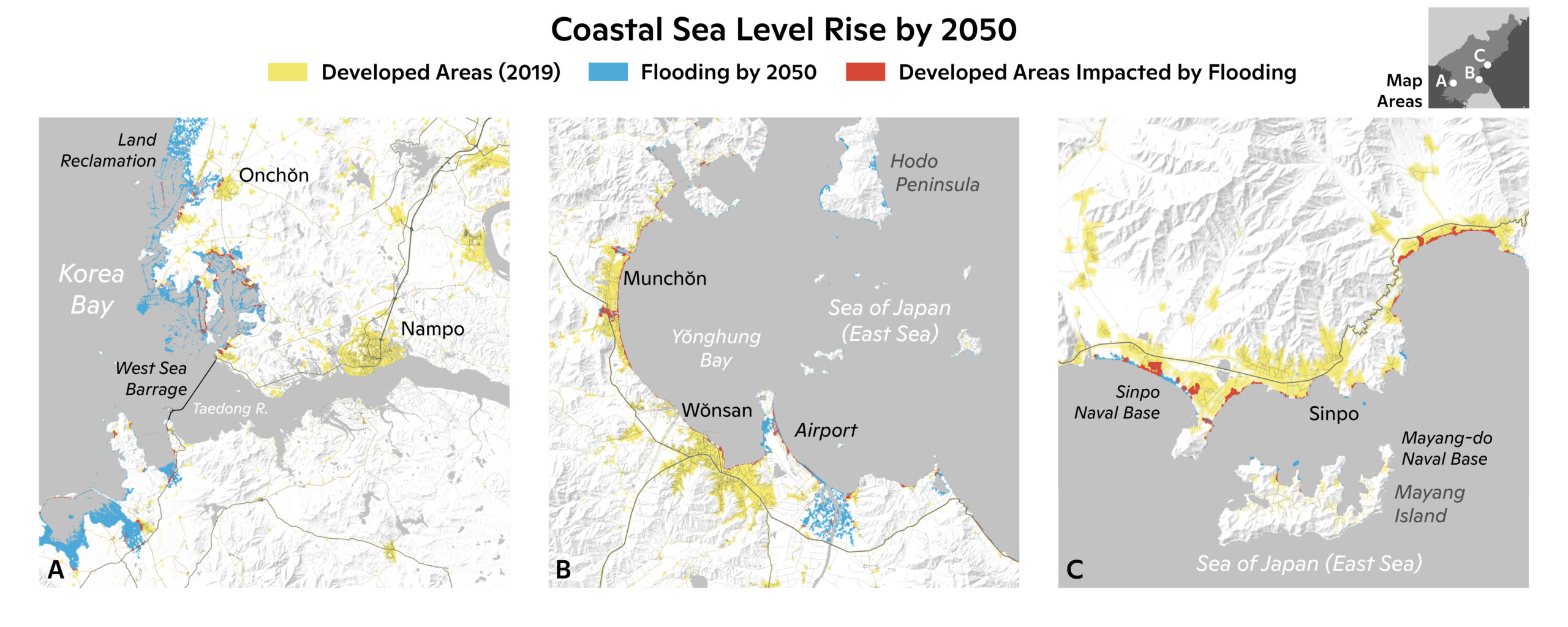
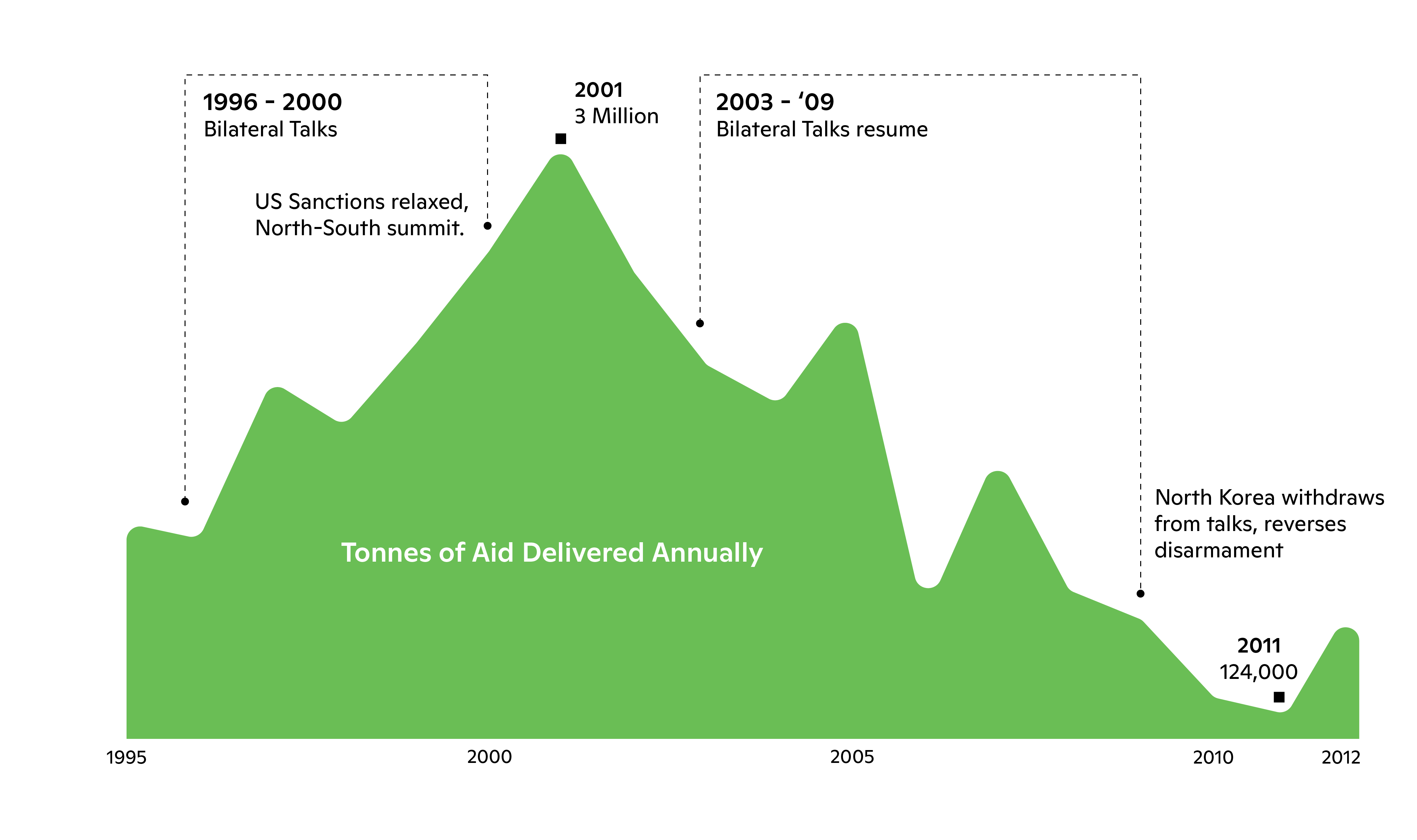
This was a difficult month. By this point, I had been in some form of lockdown for almost exactly a year, and it was taking a severe toll on my physical and mental health. I learned some important lessons about work-life balance this month, and also taking time to appreciate the few links I had to the world. My work on climate and security risk continued with a project on North Korea. I actually spoke to someone at NACIS about biggest mistakes made while mapping, and one this project was one – in the US, North Korea is often as much of a joke, as it is a actual place. This relic of a Cold War past. My initial sketches for this Story Map were covered in lurid reds, blacks, and yellows. Deliberately evoking Cold War-era imagery and playing up the danger of the DPRK, but after reflection, I realized that this wasn’t telling the story of North Korea, this was just telling the story of North Korea the character. Its a real country, with real people, who deserve respect, even if the government does not.
So, I designed the maps for this story exactly the same as if I was designing maps of my own hometown, so one did not see it as the issues of a far-off bizarre caricature, but a part of this planet. I also had to contend with a lot of places and terms in Korean, a language I had very little exposure to. Korean orthography varies between North and South, which was another challenge.
March
I rarely share it on my social media, but about 50% of my total time working on maps is actually involved in making scientific figures. I have made hundreds of figures for papers, presentations and reports on every climate related dataset one could imagine.
I spent this month working on such figures for risk in Australia, Japan, the central US, as well as wrapping up work on North Korea, India, and the Arctic. There is this odd antagonism between scientists and designers at times, but ultimately everyone wants ( I hope) the same goal: to tell the best story possible for ones audience. While it may not be as glamorous as big one-off infographics, making good scientific graphics helps make the science behind it more appreciated. And that makes it all worth it.
April
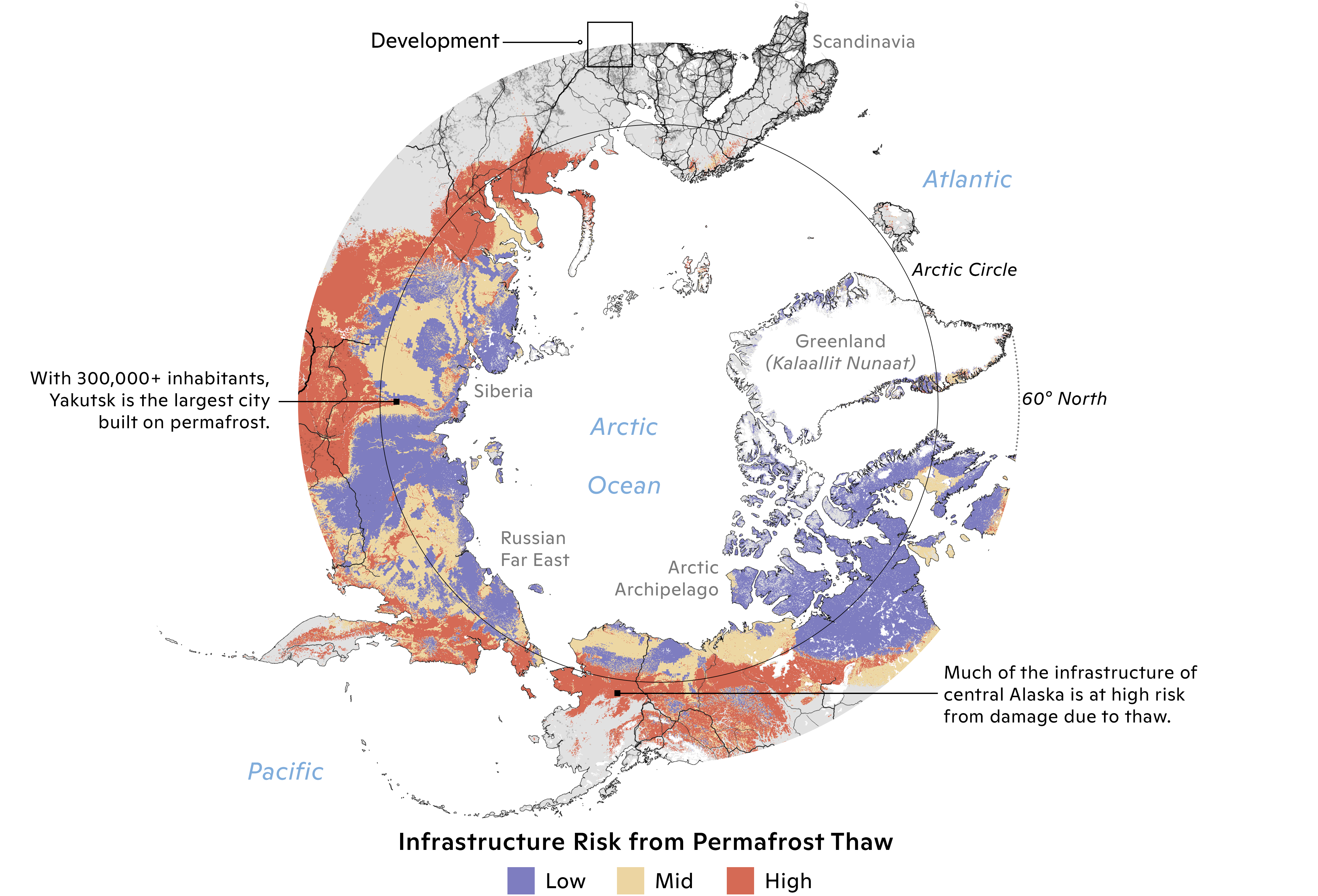
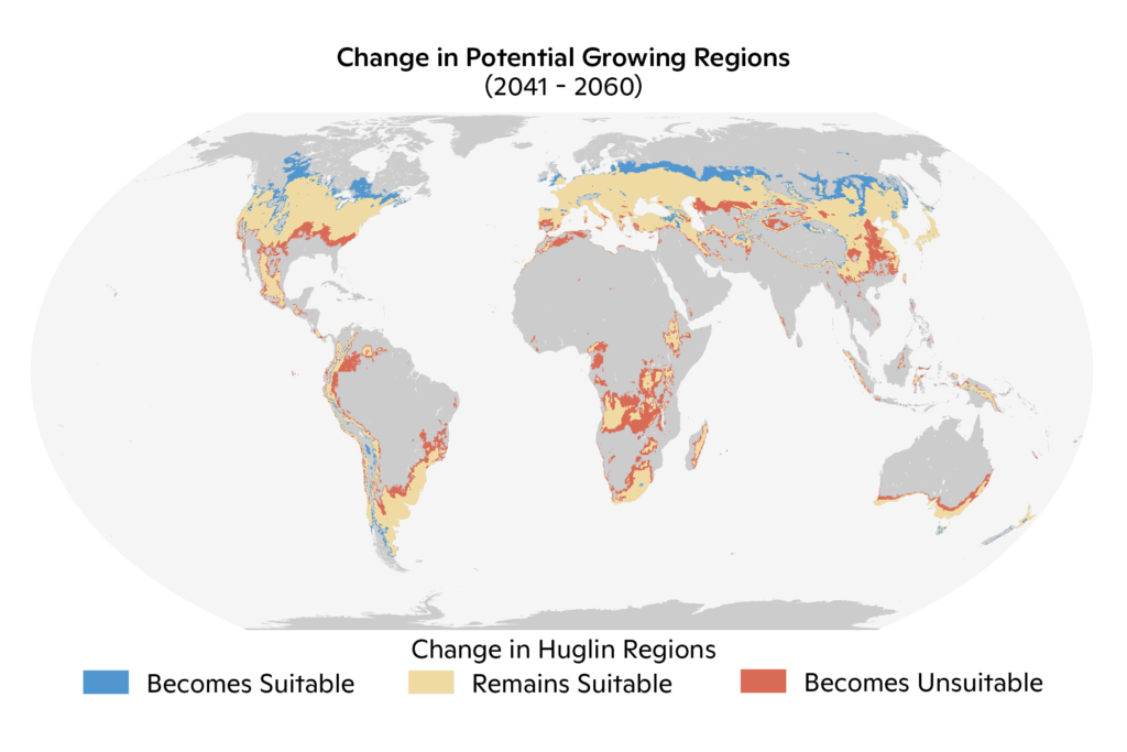
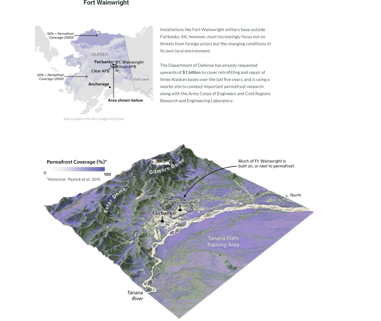
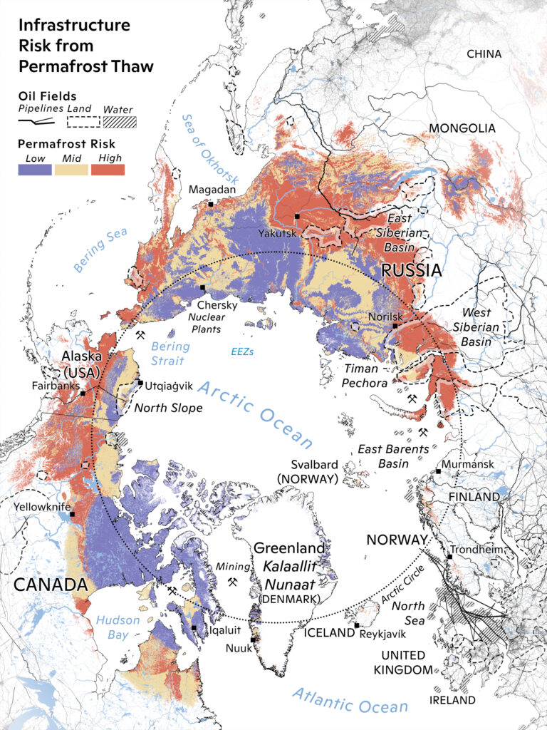
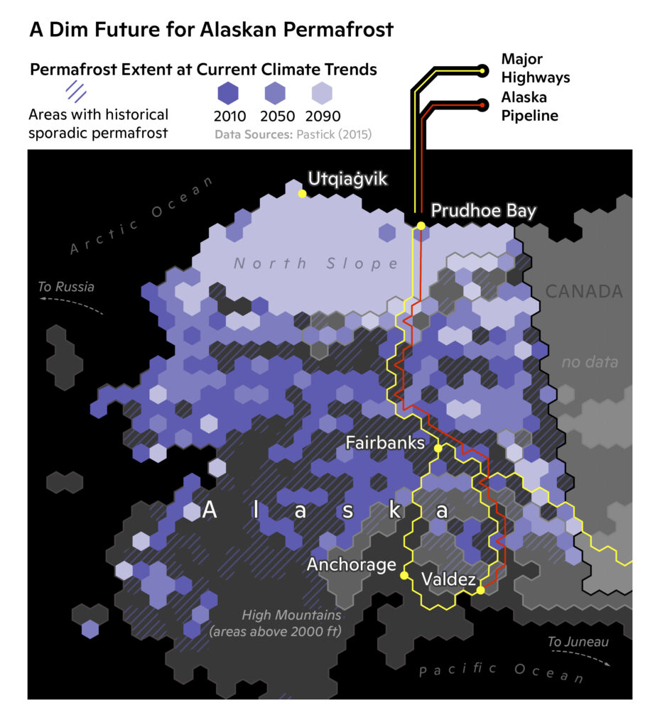
Due to a bit of a overlap in projects, I spent much of this month working on Arctic Story Maps again – but different ones. There were two concurrent projects going on, one that focused on Arctic security risk, and another on the hazard of permafrost thaw. The latter was my focus this month. I was lucky enough to get the chance to get very experimental with photo and image design in the Story Map, as I tried to push it towards as seamless of a experience as possible.
I also got to work on some larger pieces that translated the story into a infographic, and even animations showing aspects of Arctic risk and development. I have always been fascinated by animation, but it eluded me for a while. This month I started to develop a lot of techniques for finding, and creating moving content, like this short GIF of mine growth in Alberta, Canada.
May
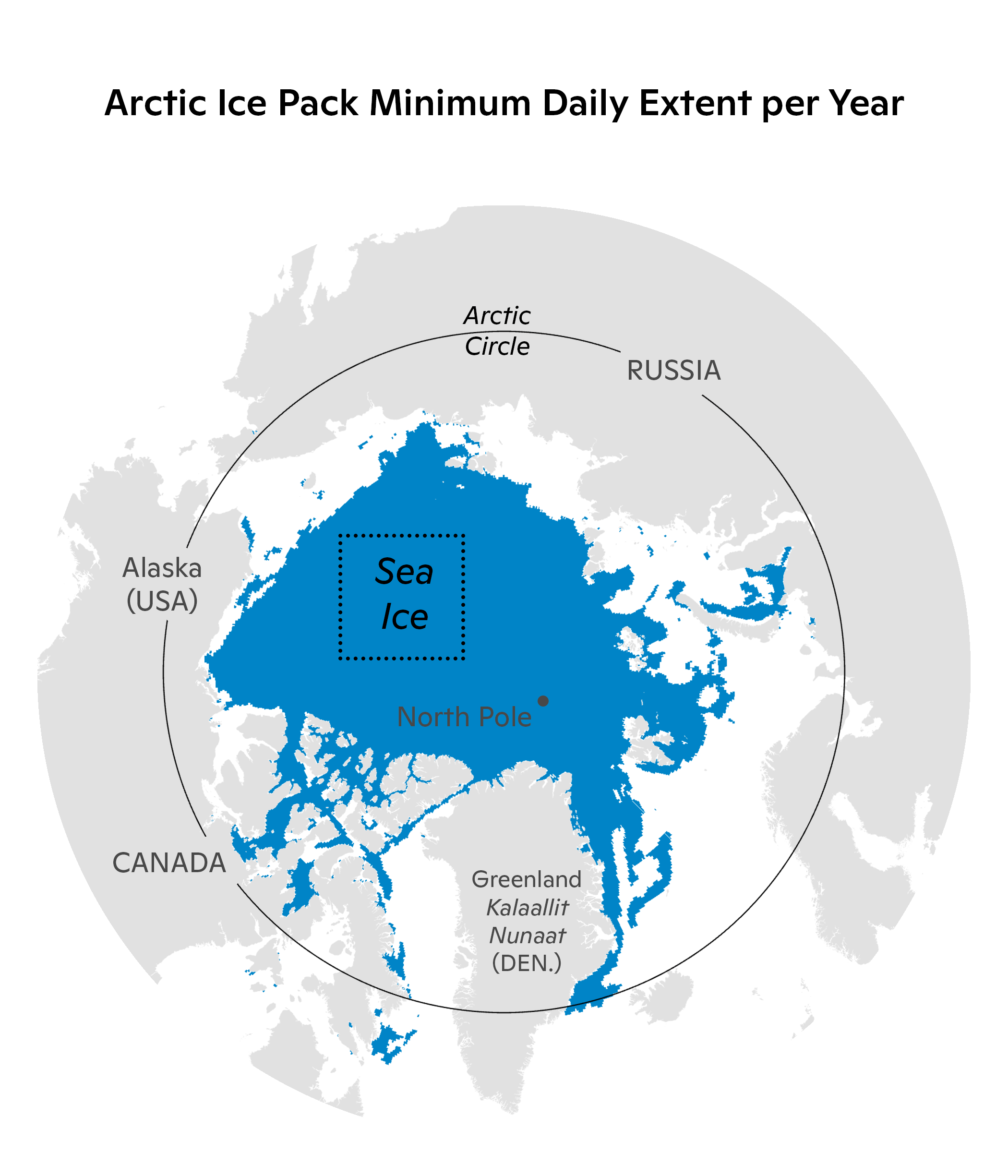
Things were a bit quiet this month. I worked on a lot of scientific figures, and got to develop more animation skills. There is a lot of storytelling power in motion, especially to talk about the passage of time. This is obviously very useful when talking about Climate Change.
This figure was a adaption of a static figure for one of the Story Maps, but our team wanted to see how it would look changing over time. I converted a stack of raster data into single extents of ice cover over the course of the 21st century, and used a short python script to export them as frames which could be composited together. This month was when I started to embrace coding as a workflow aid, and it opened up immediately a whole new world of dataviz.
June
I got to go back to the office this month! Or well, a office – since I had not actually been ‘in the office’ pre-pandemic long enough to have been assigned one. So, ~15 months behind schedule I got settled in, and immediately went to work on a lot of exciting new projects, like finally teaching myself Adobe Illustrator.
If you can believe it, this is my first map made with Illustrator, and it took a while. I have grown up with Photoshop, and the way Illustrator is similar enough to be deceptively easy to learn, but different enough that it is not, completely threw me off. I spent days hunched over my desk trying to wrap my head around the UI, but it all paid off.
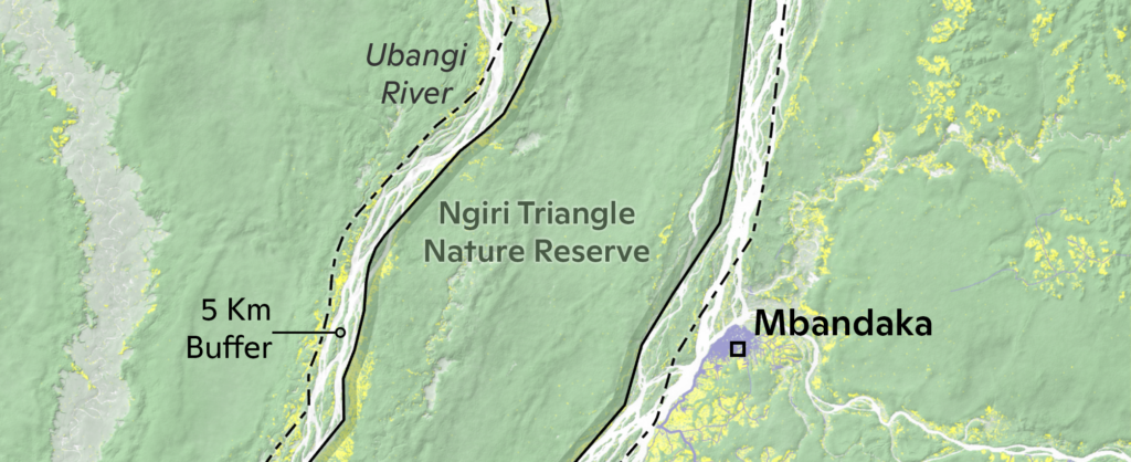
I also got to work on some long-running projects around the Congo. Woodwell Climate Research Center maintains a presence there, but it does not get as much press as our work in the Amazon or Arctic. I never work with this region for other projects, so it was a great chance to better understand this part of the world.
July
The trend of learning new things continued with Power BI. I lost my Tableau student license, and with it my old method of making attractive charts. However, I tried out Power BI which worked just as well and was importantly free. None of the figures I made with it ended up in published work this month, but that is all the more reason to share them now.
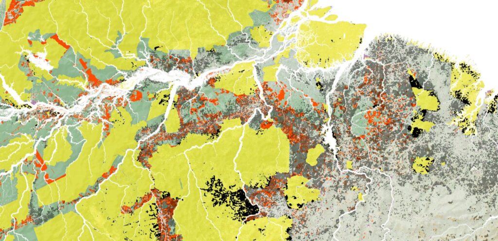
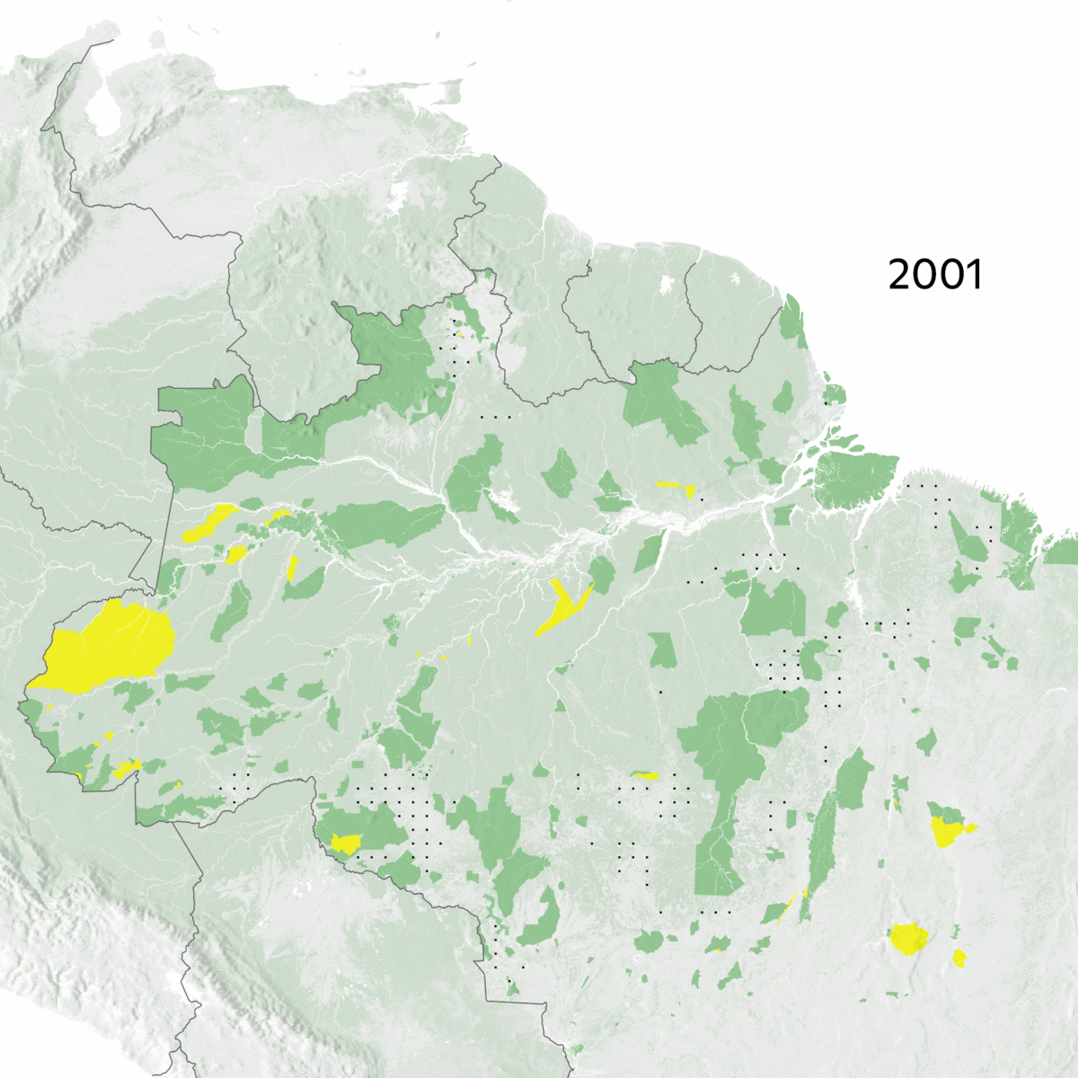
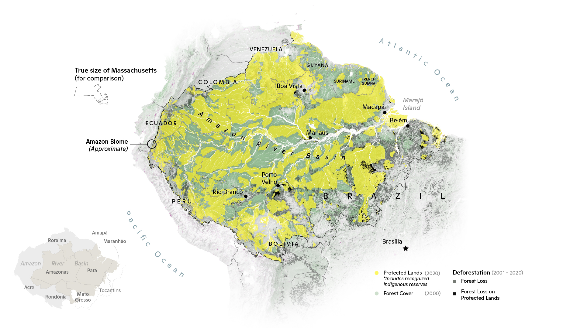
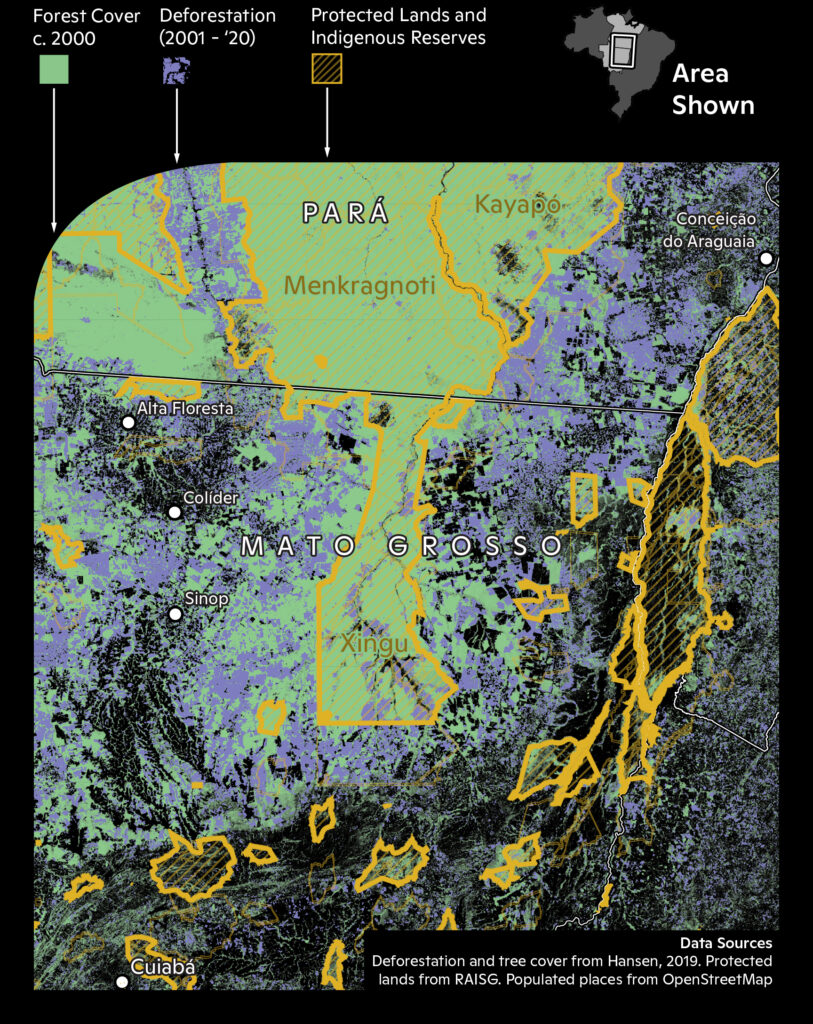
This month also saw the beginning of some new Amazon projects. Woodwell Climate Research Center monitors and reports on Amazon deforestation and fires. However, while we try hard to properly convey the scale of this crisis, we also want to make it clear that there are solutions out there. Creating protected lands and affirming Indigenous land rights, are surefire ways to curb these issues. I brainstormed some yearly deforestation animations to help show this off.
Here is the very first version, without protected lands. I was showing deforestation here, but I initially went with red as it is a more openly ‘negative’ color.
After discussion, I changed the color to black and then added protected lands. This helps tell the larger story of Amazonian conservation, as you can see how deforestation arcs around protected areas.
August
This was a eventful month in many ways. I spent a lot of time buried in javascript, both in trying to learn d3 and the Earth Engine API. D3 is a excellent language for creating graphics out of tabular data, and Google Earth Engine stores and processes massive raster datasets that are too cumbersome to handle locally. I worked on a lot of scripts and shortcuts for making satellite imagery mosaics, but also found 3rd party ones – like some excellent scripts for Sentinel 2 by Marko Repše.
The real power here was not in just working on one tool, but combining them in different stages of a project. By the end of the month, I could compile imagery and color-correct it in Earth Engine, and then animate it in Photoshop for one cohesive, engaging figure, or upload a table to Observable (my preferred platform for working with d3) and then embedding a interactive graph in a Story Map.
On a more somber note, this month also coincided with a lot of mental issues. While I know working from home was a blessing to many, for me it coincided with frustration and isolation. However, it turned out returning to work just made it clear that the issues I was dealing with would not magically go away just because I went somewhere each day. I went through a severe mental health crisis this month, and ended up with a depression diagnosis and starting a medication regimen. Fortunately, it was exactly what I needed. Depression is a disease that is as real as any other, and there is no shame in it. I got the chemical leg up I needed for all the support and wellness practices to work properly. My only regret is not starting earlier.
September
This month felt like a new beginning, and it involved some exciting breakthroughs on long-running projects. I made a lot of progress on my d3 skills, creating more engaging and smoother figures as well as experimenting with it to produce truly interactive maps.
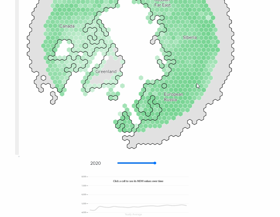
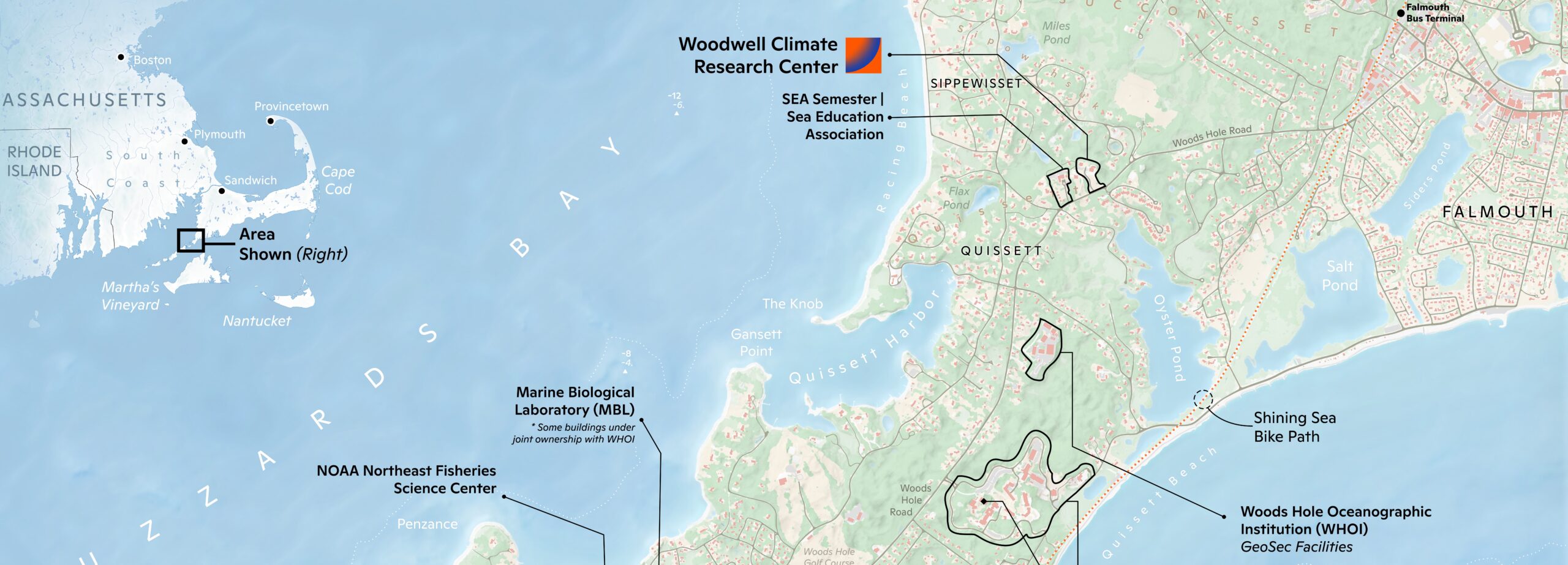
Fitting the new beginning theme, I started on a revamped map of the area around the Woodwell Climate Research Center. The existing entrance map had not been updated for over a decade, and there was a lot of interest in something that reflected not only the actual physical location, but the overall scientific community in the area.
October
NACIS month! I was happy to see other members of the cartographic community in Oklahoma City. I was lucky enough to present on some of my workflow techniques. With how hectic my everday responsibilities are, being able to work quickly is a must. I saw it as a way to help other people sidestep all of the mistakes I had to make to learn something, so they can start a little bit farther ahead themselves.
Part of my presentation was about shortcuts in different programs, like hitting [alt] in ArcGIS Pro to minimize multiple layers at once.
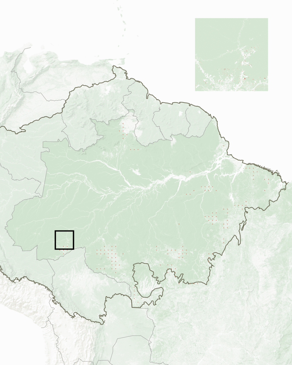
I also presented a early version of a new pan-Amazon deforestation poster. These are somewhat of a flagship product at Woodwell Climate Research Center. They are also a unique challenge, because the goal is to show in a engaging way the relationship between forests, fires, deforestation, and conservation over the course of the last two decades. Not to mention the different Amazonian countries, competing political and economic interests inside them, and different geographic features (the Amazon biome alone really has over a dozen distinct regions inside of it). The reception was so positive however, that it was eventually adapted into a magazine spread, and a inset for a Axios article.
November
#30DayMapChallenge #30DayMapChallenge #30DayMapChallenge #30DayMapChallenge #30DayMapChallenge #30DayMapChallenge
This month was dominated in my mind by the 30DayMapChallenge – a fantastic event that is exactly what it sounds like, a new map every day. Each day has a set theme developed by the challenges creator, Topi Tjukanov, and I decided to make it easier on myself by tying in as many themes as possible to my work for Woodwell Climate Research Center. Not only did it mean I would already have the data lying around, but it also was a great way to communicate our work in bite-sized pieces.
December
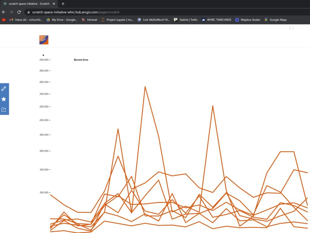
We have made it! Well, not quite. First there are a lot of experiments with using D3 to graph datasets in experimental ways, and some big maps filling up my hard drive.
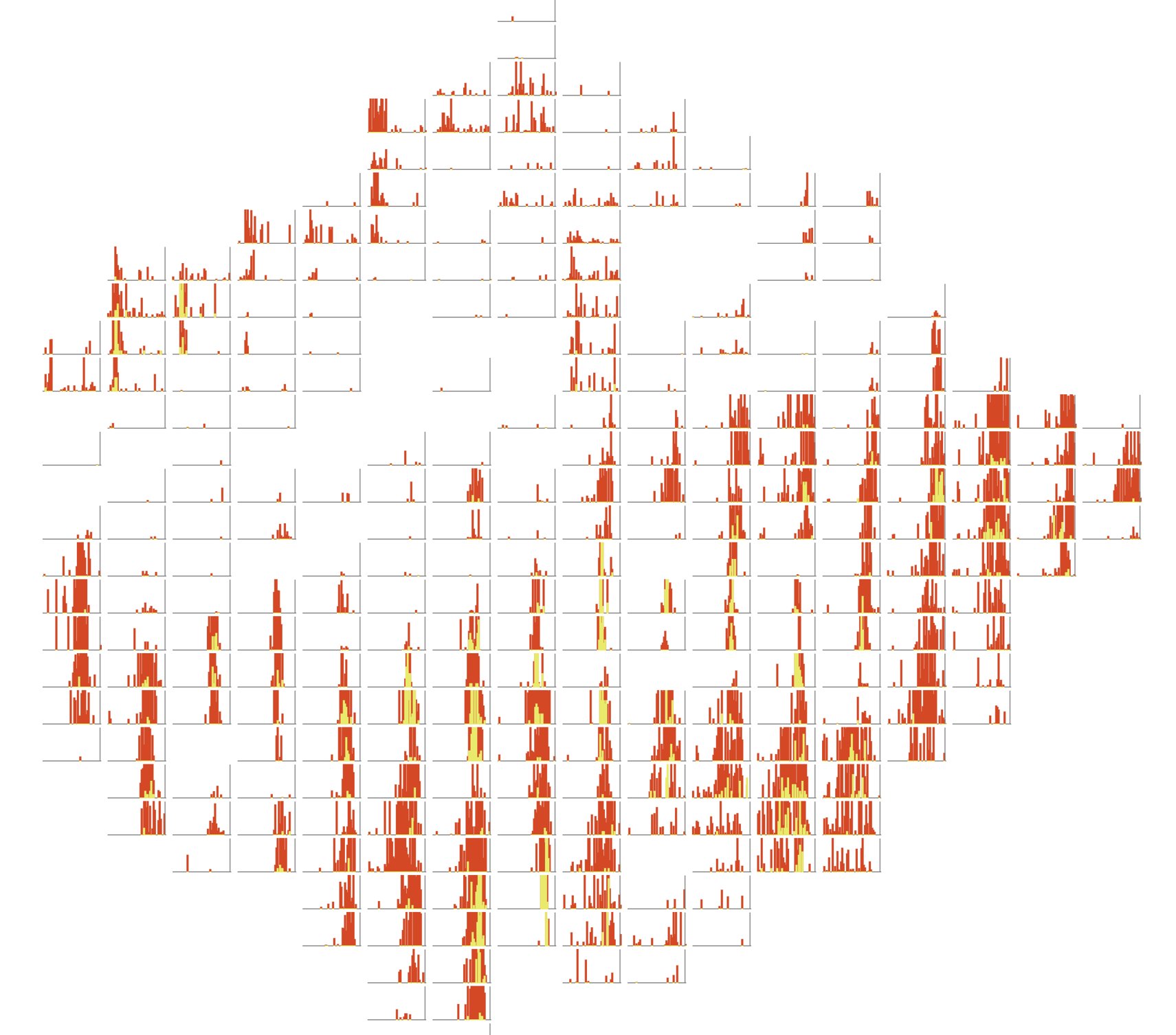
Mapping temporal data is a special sort of challenge. By its very nature, it overlaps itself. My usual methods of getting around this are animations, putting a series of figures together to show snippets through time, or identifying meaningful slices of the data and overlapping them. However, for mapping deforestation and fires across the Pan-Amazon, I knew I wanted to A: show their distribution across the region, B: their distribution over time, and C: their relationship to each other. I also wanted it to work on a static poster.
What I ended up doing was creating a collection of small multiple graphs sorted by lat / long values. D3 was perfect for this, and the best part is that this graphic can be exported as a .svg which can be opened into Illustrator.
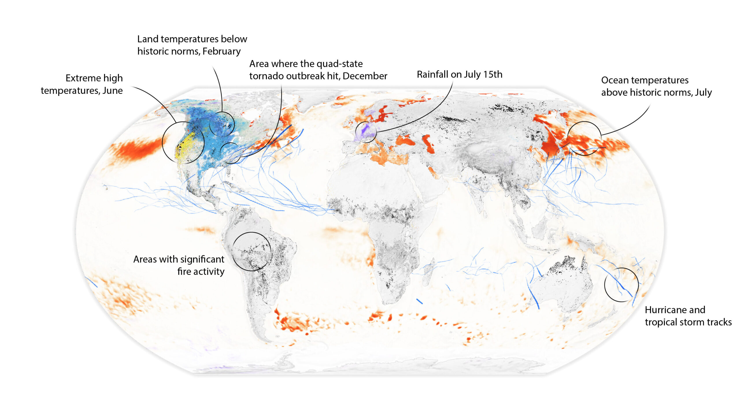
The year ended with some special wrapup articles. Besides the one you are reading right now, I also produced a series of figures for one looking at climate disasters through the year. My favorite piece among these compiled half a dozen different datasets to show disasters across the globe. This was also in a sense, a temporal project, but I tackled it a different way by letting them messily collide with eachother to produce a sense of chaos. I also masked liberally so data did not collide too much, and the centers of each event could still be clearly made out.
Personal Projects
Alongside my professional work, I relish the chances to work on side projects and commissions. They keep me learning new skills, and I get to help out people bring their ideas to life. Plus, its a fun way to unwind. Here are some highlights in no particular order.
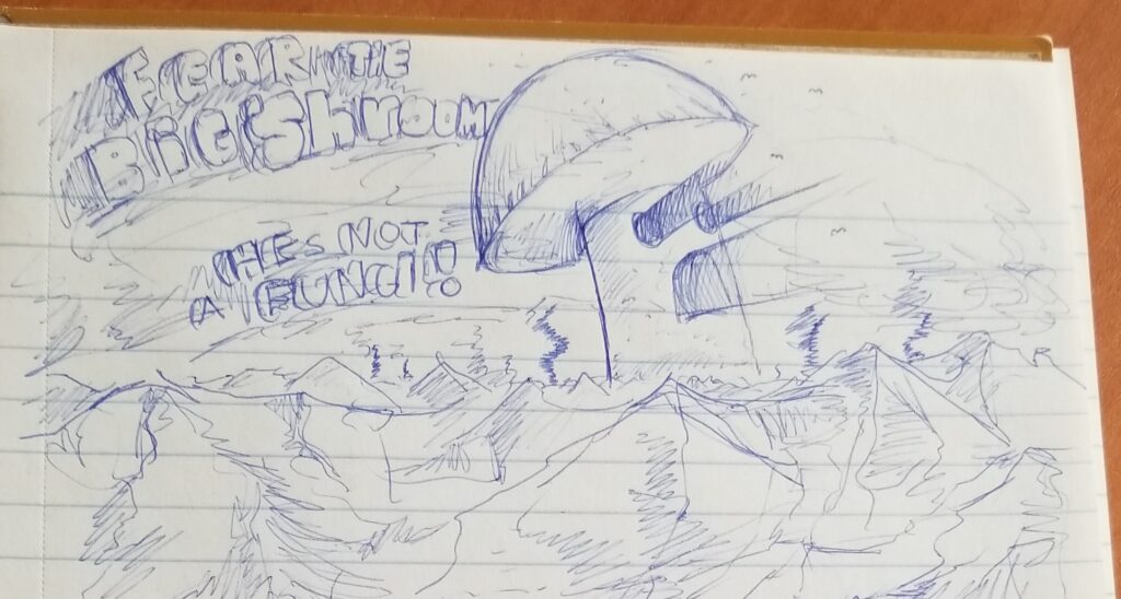
I also doodled a mushroom in a notepad which subsequently has been immortalized as a emoji on a GIS discord. Which frankly, I think is the biggest accomplishment of my career.
I had a support structure, security, and opportunities, and this year was still one of the most difficult of my life. I will not minimize my own issues, but I will keep them in perspective. Yet, this year was also full of new opportunities and growth. I appreciate the chance to tell such important stories, and look forward to another year of doing so.

Big shroom emoji made by JaggySnek