Building A Story
Many modern cartographers grew up with fantasy maps. For some, it was their introduction to cartography. A map can bring a audience into a world by giving it life and color before they read the first word.
J. R. R. Tolkien established the pop culture idea of a fantasy map with his maps for the Lord of the Rings. This map gives that universe a aesthetic that matches what appears in his writing. The quasi-Celtic lettering conveys the sort of mystical imagery rooted in British mythology, that is the aesthetic spine of his books.
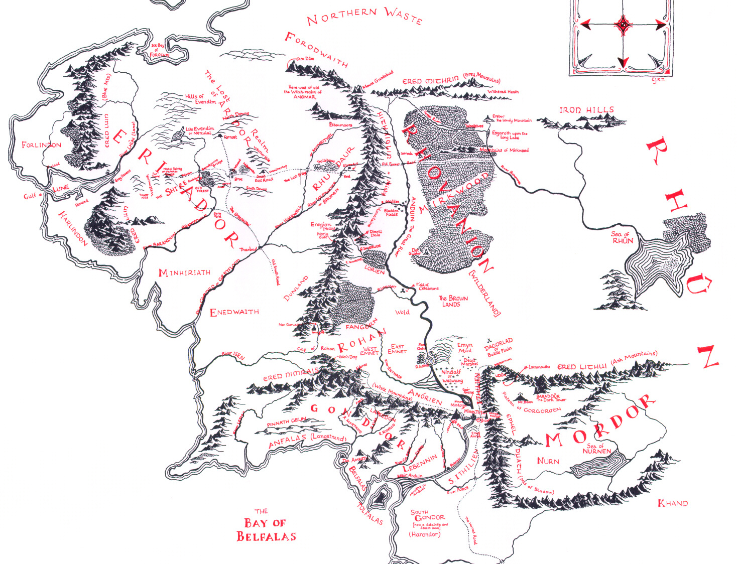
Tolkien’s map would not be as well known today if it looked like a road map you might pick up at a gas station. Not that road maps are not useful, or undeserving of praise, but for the purposes of telling Tolkien’s story a map that exaggerated deliberate archaisms, that defied what might be practical cartographic convention, excelled.
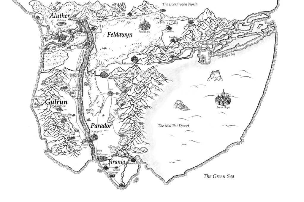
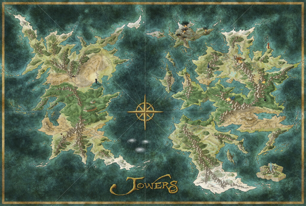
Modern fantasy maps follow in the same tradition. This map above eschews mainstream cartography for a hand-drawn style, building illustrative detail to bring the reader into a world apart from our own. The artistry of fantasy maps has inspired real-world cartographers for decades, but what powers that artistry? What fundamental lessons can we learn from how fantasy maps operate that we can apply to tell real-world stories better?
Setting the Mood
Fantasy maps obviously do not have real terrain as their subject, but there is a clear stylistic difference between fantasy and real-world maps that goes beyond subject matter. Fantasy maps differ from real-world maps in that they place more emphasis on mood. A stories mood is the overwhelming aura or feeling that surrounds it. In writing, this can be captured in vocabulary choice, grammar, or even the design of the page. Art primarily shows mood through texture, color, and composition.
Maps (in the Western conventional sense) are a visual medium first. You can capture mood in a map the same way you might in a painting. Many real-world maps do not go to great lengths to accentuate mood because real-world landscapes do not have inherent mood. Earth exists independent of human imagination – there is no such thing as evil dirt.
In fantasy the map exists as a representation of landscape as it exists inside that story or that universe, which is itself built on the themes and ideas the author conceived. The map is a device for highlighting those themes to the audience. The landscape, the appearance of the map, fundamentally do not need to serve any other purpose or be responsible to any other scrutiny.
Nobody will correct you if you, the author, mislabel a place on a fantasy map. The fantasy cartographer is judge, jury and executioner. This gives them free reign to make the map to capture the themes they envisioned as they designed the world itself. Real-world terrain is not as open-ended. There are real people living in the area, real histories, data and clients that limit design decisions. None of this is inherently wrong of course, but it means that real-world cartographers spend less time exploring the artistic possibilities of mood like a fantasy cartographer can.
Building mood in real-world maps is therefore sometimes overlooked. Humans interact with the environment and have experiences inside the environment, and these experiences have moods. A place that is a source of happy childhood memories might be a source of pain to another. A child might remember their years in a house differently than the parents. By attaching our experiences to real landscapes we create moods that maps of these stories, set in those landscapes, can try to capture.
To build a better sense of mood is as easy as adjusting parts of the visual design of the map to touch on cultural and even psychological traits. I want to caution here again that this article is talking about culture in a modern, Western sense. Some of the examples highlighted here are not universal and a good cartographer pays attention to the dominant views and backgrounds of their intended audience.
Color
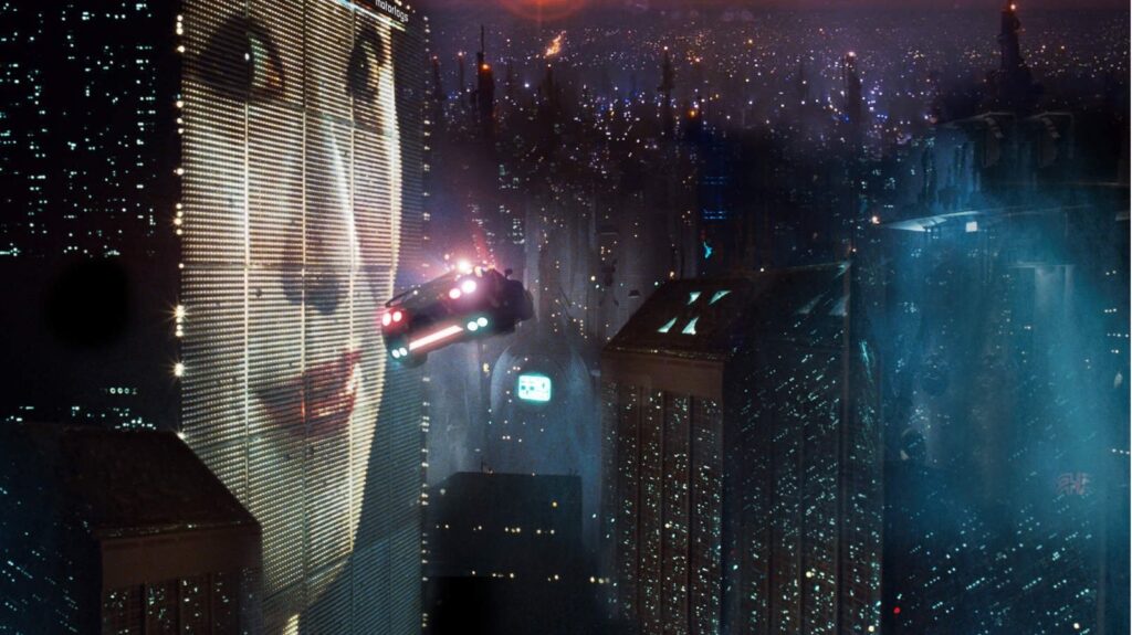
The film Bladerunner is set in a bleak futuristic Los Angeles. It uses a limited color palette, with dark blues and neon reds to build a sense of complete dread. Frames are covered in shadows with harsh highlights few and far between, forcing the viewer towards constrained angular areas of light and focus, building claustrophobia inside a overgrown metropolis.
Every culture in history attaches meaning to color. These meanings can be used to evoke emotions in art by using those colors. Kenneth Field’s map of deaths in the Grand Canyon borrows from horror aesthetics to attach a macabre mood to a real place. A bright, bloody red is crucial here. The same map in blue does not have the same effect.
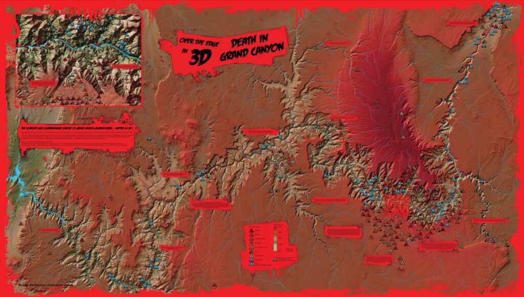
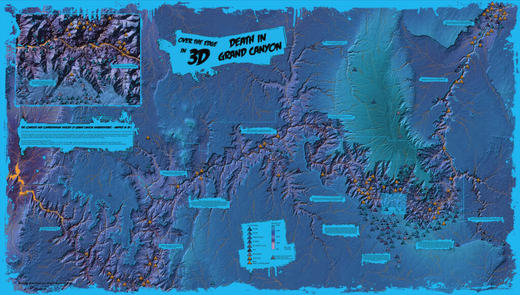
A bright shade of red conveys danger and even violence. Red does not always mean this, but by also setting that color with other design elements we associate in pop culture with violence cues us into reading that meaning from that color. The Grand Canyon is not inherently evil, but just like a map cannot contain all of the information about a place a map cannot display every emotion a person / people associate with that place.
Texture
Texture can be tricky. When texture is discussed in painting it often refers to the physical surface itself. How we perceive the texture of that surface is built on more fundamental factors. I think of texture in two components: detail and sharpness. Detail is just how much information there is inside that space. White noise has more detail than pure white. There is more variation, more information besides just a single color.
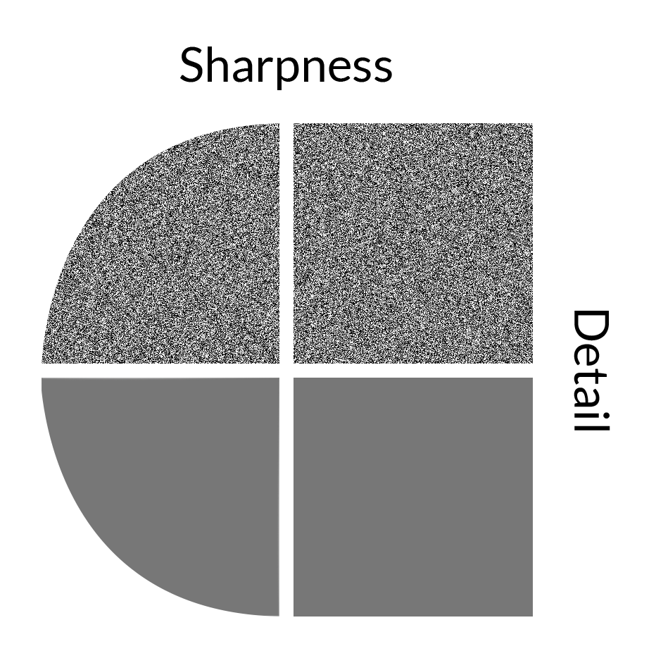
Sharpness is how much contrast there is between the information inside that space. A sharp edge cuts off more dramatically than a soft one. Simultaneously, a rough texture has more detail than a smooth one. Rougher, more contrasted surfaces can seem harsher, more aggressive than soft ones. We can extend these ideas to shapes themselves.
There is a term in psychology called the Bouba/Kiki effect. Humans interpret some shapes as ‘softer’ or ‘harder’ compared to others. When given two shapes: one more jagged than the other, and two names (Bouba, and Kiki) most people give the more jagged shape the name ‘Kiki’. Shapes have moods just like colors. Along similar lines, a image that is perceived as ‘sharper’ might come off as more intense (not necessarily negative) compared to a blurrier counterpart.
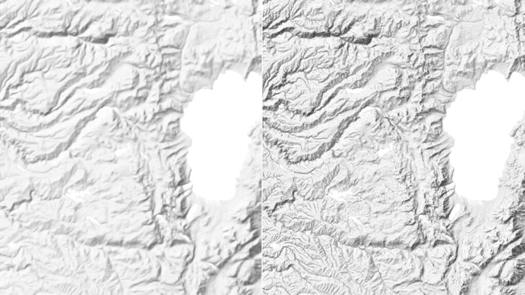
From the same set of data, you can make ‘Bouba’ terrain (left) and ‘Kiki’ terrain (right). Accentuating detail and sharpness on the right image makes the landscape seem more intense compared to on the left. This is not negative by itself. Many fantasy maps add detail to give the viewer insight into a world or even just to enjoy pouring over every part of the overall piece.
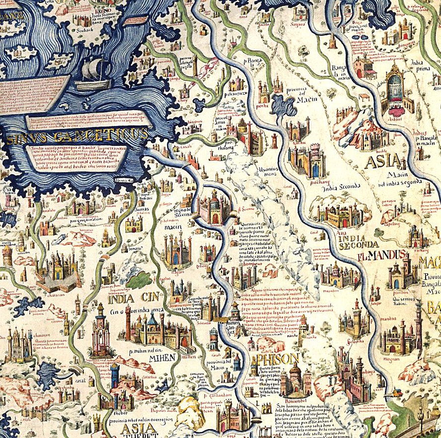
This excess detail – excess being beyond the bare minimum needed to understand the map – can make a map feel more real, more a work of art than a navigational aid. Remember, many of the tropes associated with fantasy maps are based on real map making styles of the pre-modern era. Before the era of scientific mapping cartographers filled their works with so much detail it had a name: Horror vacui. Fear of Empty Spaces.
Using empty space itself is a stylistic decision. Putting certain things in focus and others in the background can convey just as much as cramming detail into those spaces. This leads us to the last element in building mood: composition.
Composition
Maps are like all other forms of art in that they primarily put the most important part of the composition at the center, the easiest point to focus. Something as simple as how much of that center the point of focus occupies can carry meaning.
Most fantasy maps join real-world maps in following this principle. After all, it makes sense that the most important parts of the area the map covers are at the literal center of attention. Yet when that rule is violated, it creates a different effect. The absence of that predictability conveys its own message, as does what is filling that space instead.
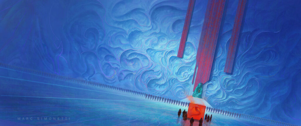
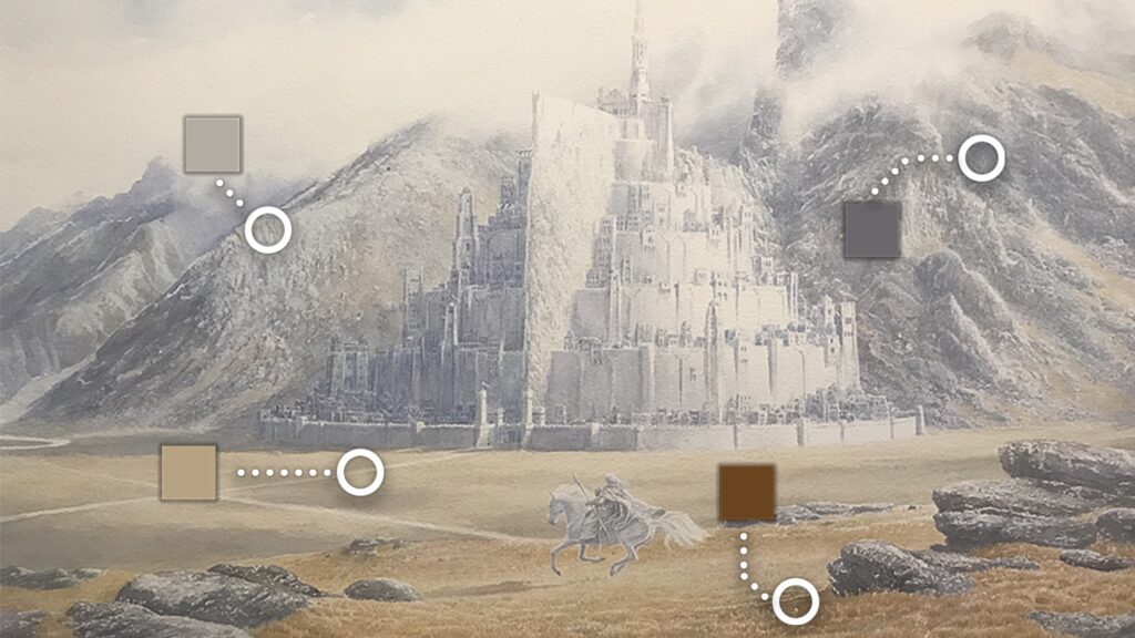
A common trick to building a sense of grandeur, of great space, is to have the overall image much larger than the intended focus. The above piece places the natural object of focus, the small party moving towards the throne, away from the center of the painting so your eyes are drawn towards the massive presence of the back wall instead.
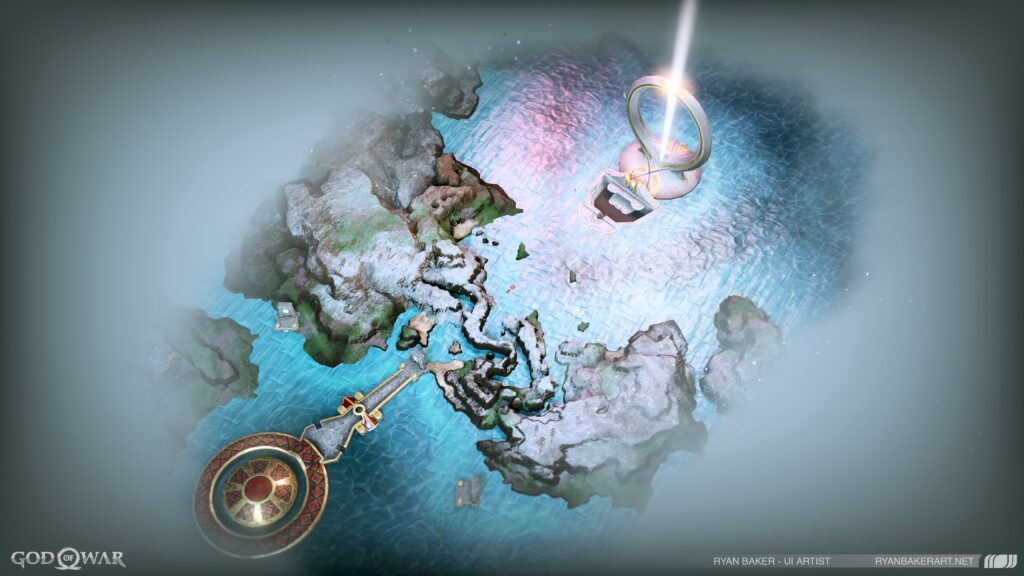
When a map places something other than the most obvious object at the center of focus, it indicates to the reader that there is something else going on. The above map has two large elements that each might serve as a plausible center of focus. Yet, the center is around a point between them. This indicates a journey between the two objects. For this maps intended use (as a level in a videogame) this makes sense. The player moves from the lower left object to the upper right along a path going through the center. The path is the focus of the map, not the hubs at each end.
By considering how a map is framed you also consider what is going to be left off. How much of which elements you leave visible on a map gives symbolic weight to those elements. This can aid in building a perception of a landscape.
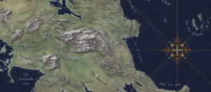
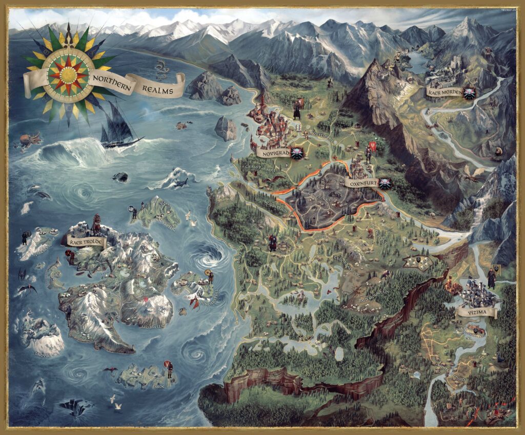
The below map is also for a videogame, but this one is where the player freely wanders through a small corner of a large continent. Areas that are playable in-game are exaggerated at the expense of the mountains to the north which are themselves expanded to form a natural border. The map has been framed so the center is a area of war-torn no mans land (highlighted in orange), which is pivotal in the games story.
Finding Inspiration
Color, texture, and space all work together to reinforce the atmosphere you are creating. This can be daunting, and I always advise that you look for inspiration first before trying to force it out organically. One can make engaging, interesting maps, if they choose to ignore conventional mapping completely and look at different types of art.
One of the easiest ways to do this is to pull colors directly from reference material. Here are colors copied from a painting by Alan Lee, who worked on Lord of the Rings (among other things).
Art can also give you interesting color palettes that might not come up if you think about conventional terrain. One of my favorite artists is the French illustrator Moebius. He uses bright pastel pinks, purples and yellows to make gorgeous desert landscapes.
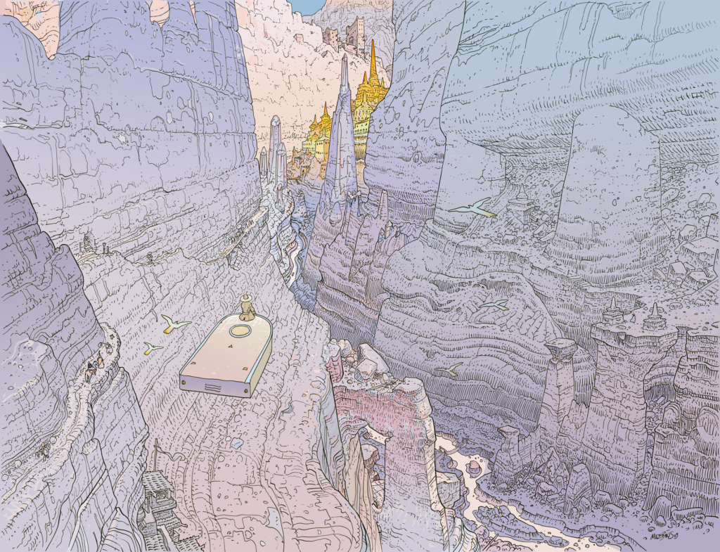
Here are some values from that image distilled into a single gradient.

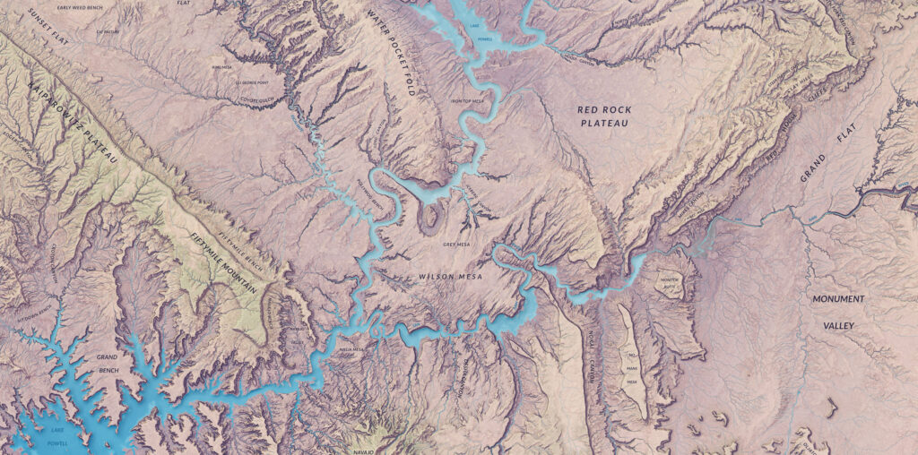
Cool clean colors lend a different atmosphere than the usual palette of desert browns, reds, and yellows. When that is applied to real terrain (in this case around Grand-Staircase Escalante) it ends up looking quite different than most maps of the desert.
Applying Inspiration
Inspiration can extended beyond static maps. You can take fantasy styles and put it into web maps like in a Mapbox style.
Another great example of fantasy styling over real-world terrain are the ‘My Precious’ styles made by ESRI’s John Nelson. These can be downloaded and applied to any part of the world through ArcGIS Pro.
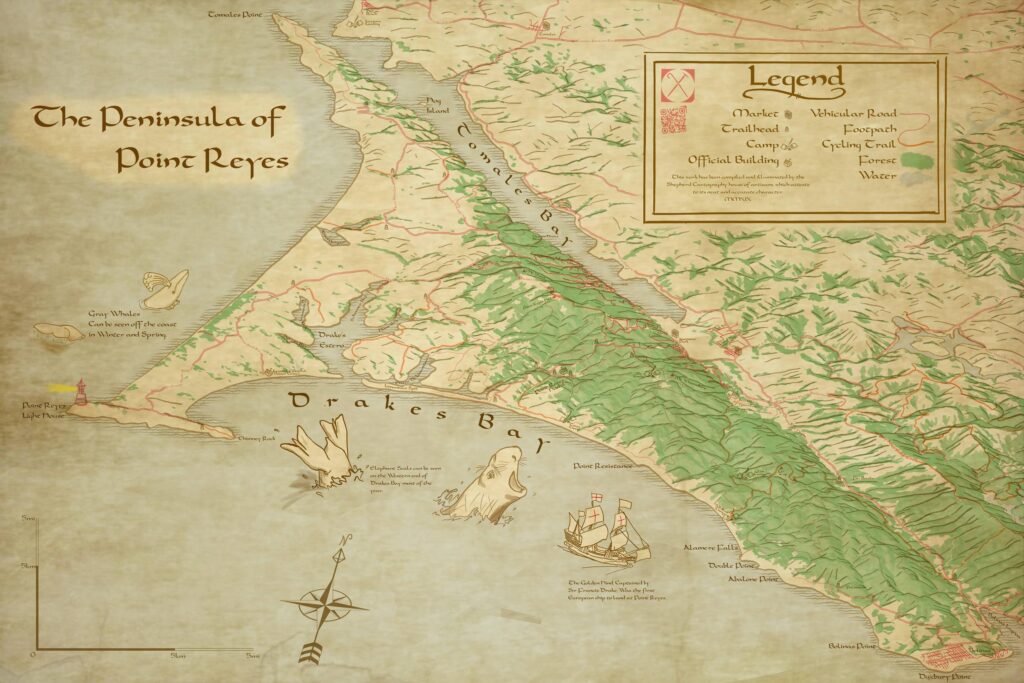
You can also make maps that have fantasy trappings but still serve a second practical purpose, like a hiking map of an area in California.
Part of the power of maps is making your audience look at a place in a different way, and making real places seem fantastical can do that. This is what I want to stress last. Maps are made by, and for, people. All the tools I have been talking about are for the benefit of a human audience.
The power of seeking unusual inspiration for maps is finding new ways to reach this audience. I hope you enjoyed this article, and I encourage you to find your own inspirations.
I love your work! I already learned a lot with it and I’m trying to adapt to the landscapes of my country.
Thank you for share!