As much as the Swiss Style defines antique cartography, it also is not a monolith – nor is it representative of the many other schools of cartography in the 18th – 20th century. As I have continued to experiment with recreating vintage styles in digital maps, I have increasingly become more interested in naturalistic coloring. Capturing where vegetation is, where rock is, different types of vegetation, etc.
I decided to try out a map that would more accurately capture land cover than just hint at it, like my Imhof-style map did. No disservice to Imhof either, many of his maps incorporate stylings hinting at land cover, but for that particular style it was really all elevation and angle of landscape, not what that landscape actually was in reality. This tutorial then, is a sequel of the first, with many of the same ideas but pursued for a slightly different aesthetic.
Because this map will be in many ways the same style as the Imhof map from the last tutorial, I will save detail for places where I am applying different techniques. That is either new techniques just to achieve a different style, or refinements of practices I developed for the last map. I am going to keep the same layout for this tutorial to make reading easier, but many sections will be shorter.
Goals
Unlike the last map, I want to evoke a different style of landscape. Where I am paying attention to land cover as well as elevation, slope, and angle. Like the last map, I want to ‘pass off’ a digital, automated construction for the sort of intricate hand-made designs of a manual map. Practically this means I will be making the same map again, but then changing up my techniques for color and detail.
I also want to refine some of the most manually intensive parts of my map creation workflow, especially labelling. Anything that you can do to cut down on time without equally compromising quality is always a good move. As much as there is a romanticism to laboring over a work, finding ways to achieve the same results more efficiently not only gives you more time for, well, more projects, but also forces creative solutions. Like I have said before, if you can automate the production of a image that once required manual labor, than you understand the fundamental patterns that make that manually produced image so desirable.
Software
ArcGIS Pro and Photoshop. For this map, I will end up using Pro for more than I did last time.
Data
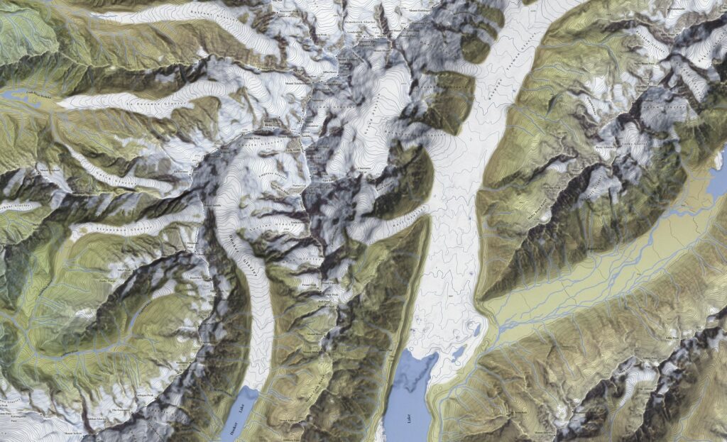
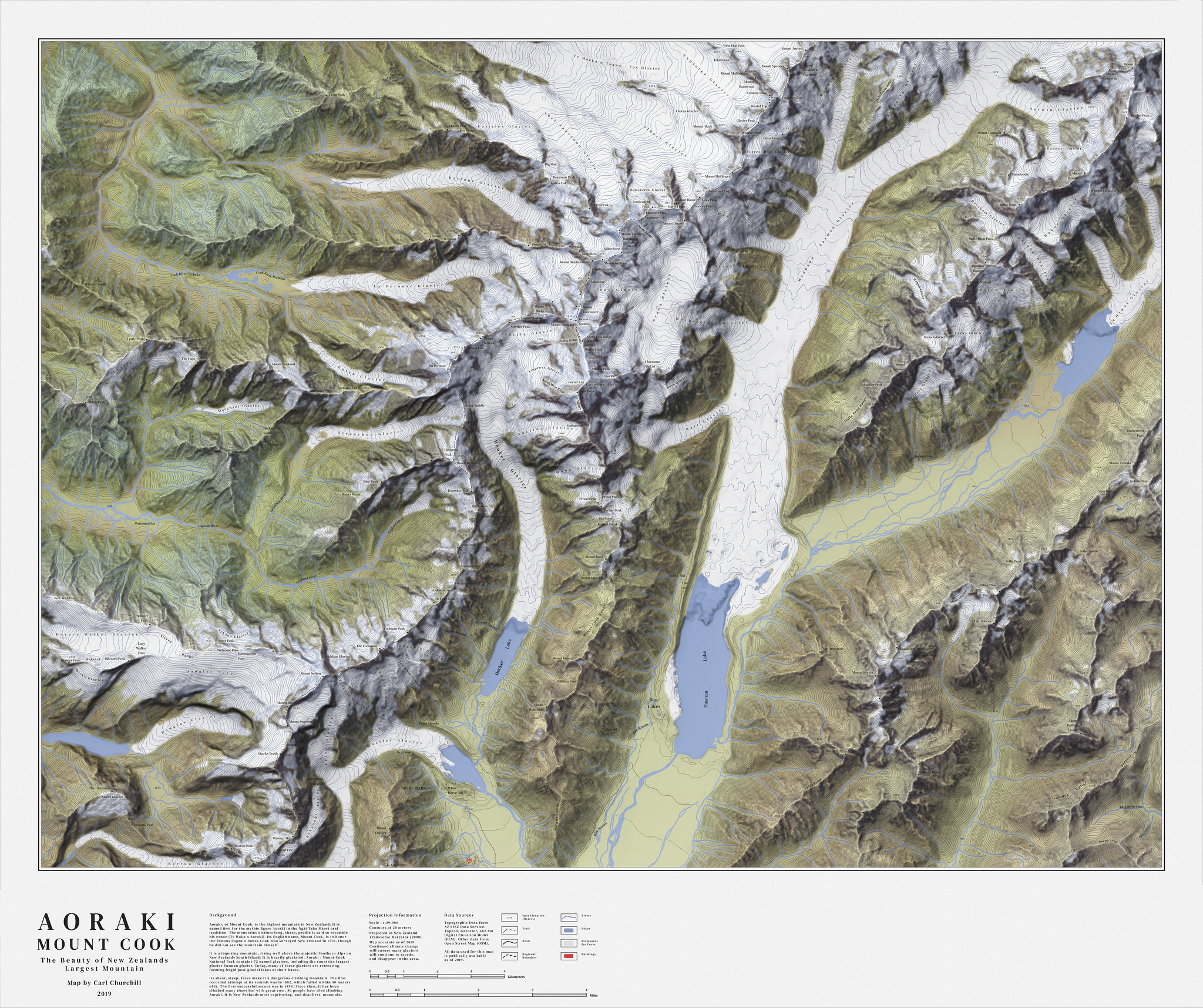
Like the last map, I wanted to find a mountainous area. This time, I was on a kick of learning about New Zealand and, surprise surprise, New Zealand has some gorgeous mountains. This map will be of Aoraki, or Mount Cook, which is New Zealands tallest mountain. It is perched right along the Southern Alps, which besides being some of the most beautiful mountains on earth, also were a filming site for much of Lord of the Rings. My only regret is not hiding a balrog somewhere in my final map (or did I).
For this map I could pull everything I needed from the NZ LINZ Data Service (linked at the bottom of this tutorial). I did experiment with OpenStreetMap (OSM) for this map, but it never matched LINZ for accuracy.
For elevation I used a 8 meter DEM from the same service.
Preparation
Lets get some basic details out of the way. I put everything into the same folder I had my ArcGIS Pro project in, checked my projections (everything came in New Zealand Transverse Mercator which was convenientally already perfectly fine for my needs), and then clipped the data to my project area. I always clip a more generous area than I actually intend to map. That way, if I need to adjust the layout a bit later I can without worrying about running out of prepared data along the edges.
I generated the same list of .tif greyscale files, but I also exported some land cover data. With other maps that show land cover, I prefer raster data because it is usually much finer resolution, which lets me pull more naturalistic shapes out of the data. A important caveat of land-cover data is however, that land-cover changes much more than say, the shape of a mountain. A area that is farmland now might have been forest last year. When trying to make a map that captures how a area looked like in the past land cover data is risky business because it will rarely reflect that. However, in this case I was dealing with a remote, inaccessible area where there is not much human presence to begin with, and I also was not trying to capture any specific period. So, it was not a issue here.
The data I could find for land cover was vector format, but luckily it was still fine enough that I could easily pull natural-looking shapes out of it. I exported this data with unnatural, wildly contrasting colors so I could more easily pick out individual ones in Photoshop later. I could have extracted different land covers in ArcGIS Pro, but that is a good step more tedious than just using the Photoshop color selector.
Making the Relief
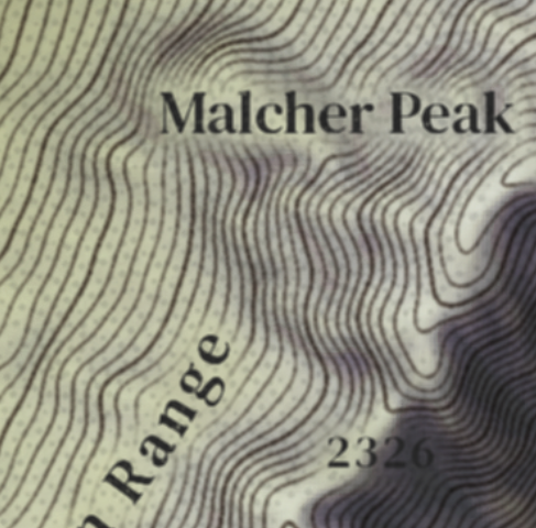
One thing that immediately pops out about the Aoraki / Mount Cook landscape is the glaciers. Glaciers are fantastic for relief maps because they break up dense, rugged areas. They are a touch hard to color, but that will be discussed later. For now, the landscape practically makes itself. With terrain this beautiful, it does not take much to make a good relief. That said, lets go through the steps. The basics remain the same as my last tutorial.
I have uploaded all the tutorial images at full size, so you can zoom in to see a lot of the smaller details if you wish.
Step 1. Base Relief
I start with a hillshade with the contrast lowered using the level tool. For this map I experimented with using Daniel Huffmans relief technique using Blender, which provides more realistic shadows than one made in ArcGIS Pro. You can read it here.
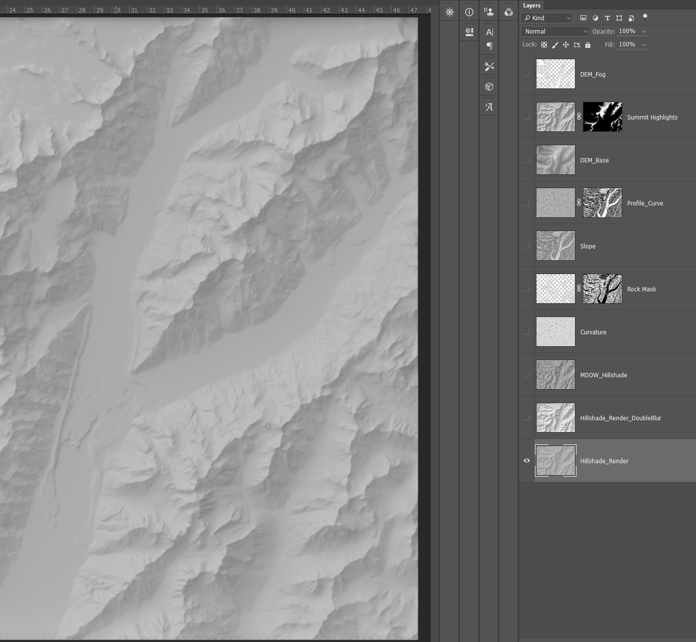
Step 2. Blurring Hillshade
A second, blurred hillshade with the median filter added a bit of emphasis to larger landscape features.
Step 3. MDOW Hillshade
In the last map I used both a MDOW (where the light is shaded from multiple directions) and a Sky Model (based on a simulated atmosphere) hillshade. These are both part of the Terrain Tools add-on for ArcGIS Pro. You can find it here.
This map, I unfortunately ran into so many technical issues generating a Sky Model hillshade I just used the MDOW. The great thing about MDOW hillshades is that they add more detail to a map than a conventional hillshade could ever give, mimicking traditional shading techniques (artists often changed lighting angle for troublesome areas).
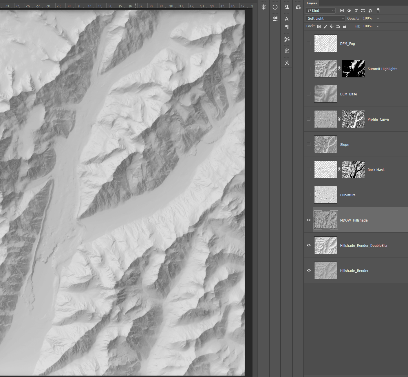
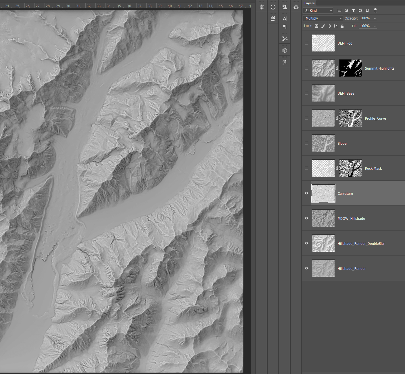
Step 4. Curvature
I simplified my curvature process from the last map. Looking back, all the extra work in masking and overlaying three curvature rasters did not correspond to a equal increase in quality, so I dropped to just two. For the base curvature, I did not mask it at all and just blended it in. I apply the profile curvature farther down after a few more touch-ups. You can read more about what curvature rasters are and what they do in my last blog post.
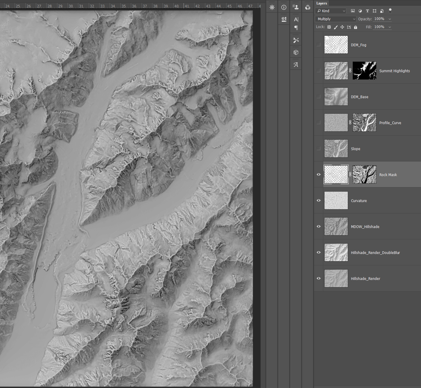
Step 5. Enhancing Bare Rocks
This map had a lot of areas of bare rock. Since I was using land cover data, I could isolate them and give a bit of special treatment. I extracted the rock cover out of the land cover data and used that to copy the curvature raster to double it up. Then, I used a slope raster to mask it.
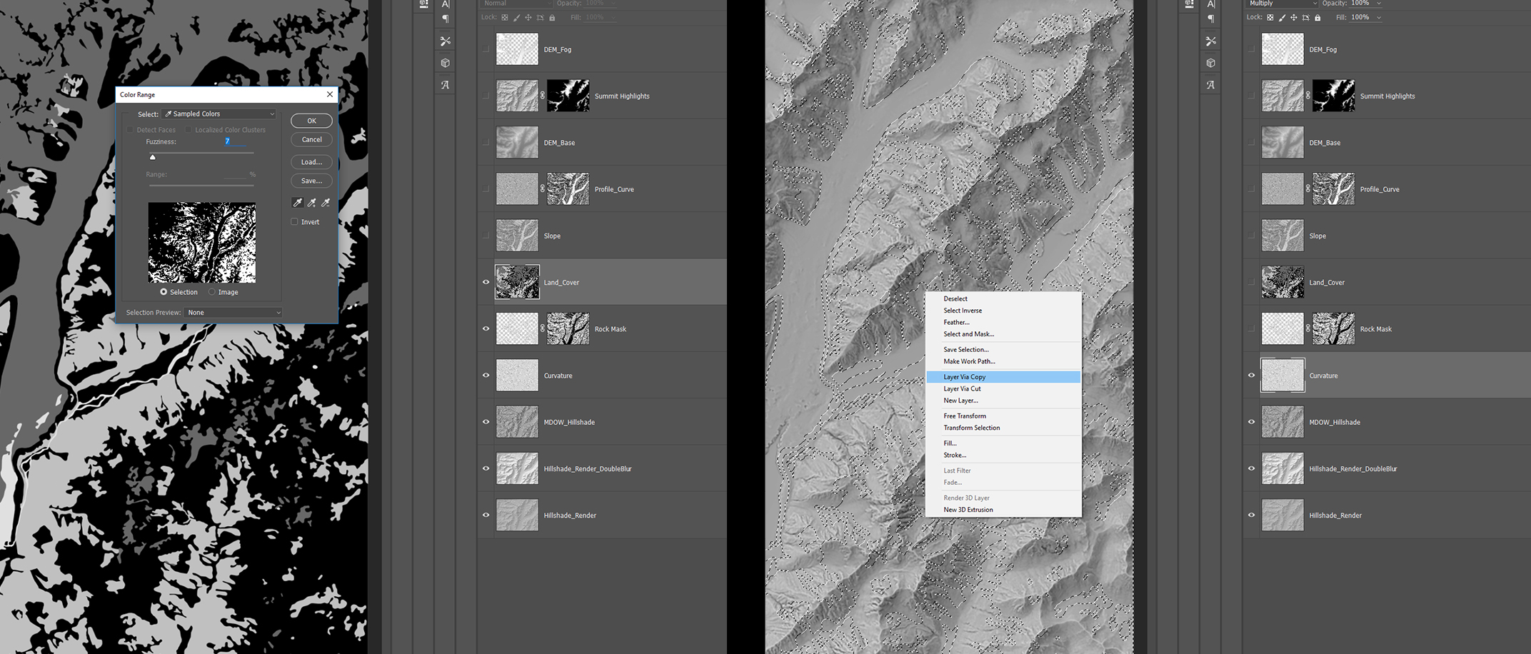
The slope raster blurs the hard edges of the original land cover vector and emphasizes this extra layer in steeper places while blurring it in smoothly into flatter areas, where bare rock often gives way to ice or vegetation.
Step 6. Inverted Slope
Slope rasters are also good to add detail by themselves. I always invert slope rasters before overlaying them. By default a slope raster is overwhelmingly dark and tends to bury flat areas in shadow. Flipping it adds much-needed light to these areas while giving some equally needed depth to rugged slopes.
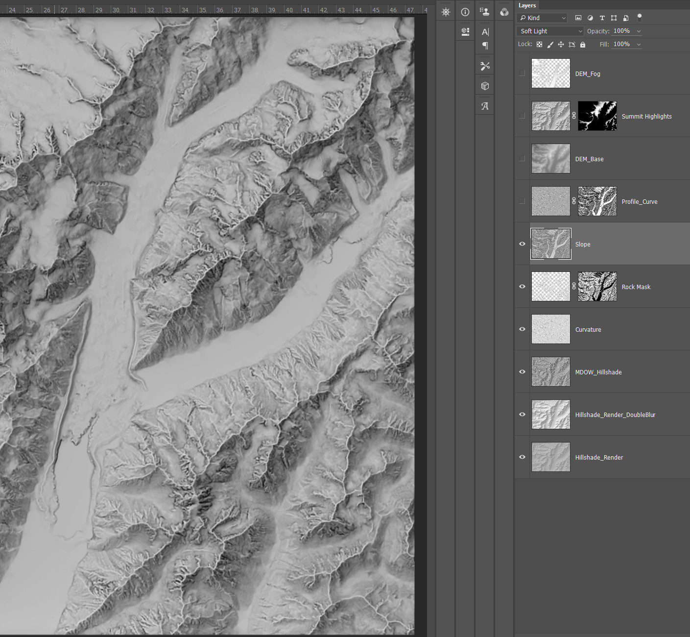
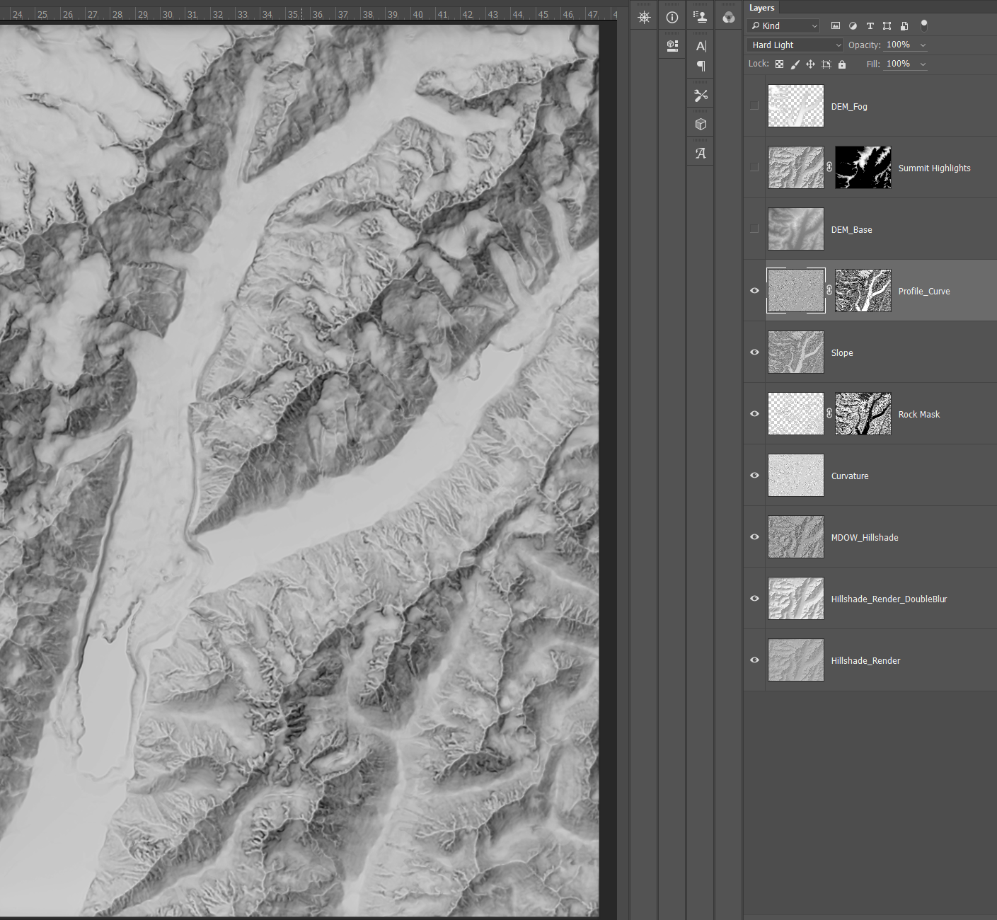
Step 7. Profile Curvature
I add back in the profile curvature here. The exact steps on when to apply different overlays can make a difference in the final image, though it is never significant in my experience. In this case, I was moving along and decided I wanted to add a bit of emphasis to flat areas that the base curvature was not doing enough for. So, I masked the profile curvature with a inverted slope, blending it with hard light instead of the usual soft light option to make it stand out more.
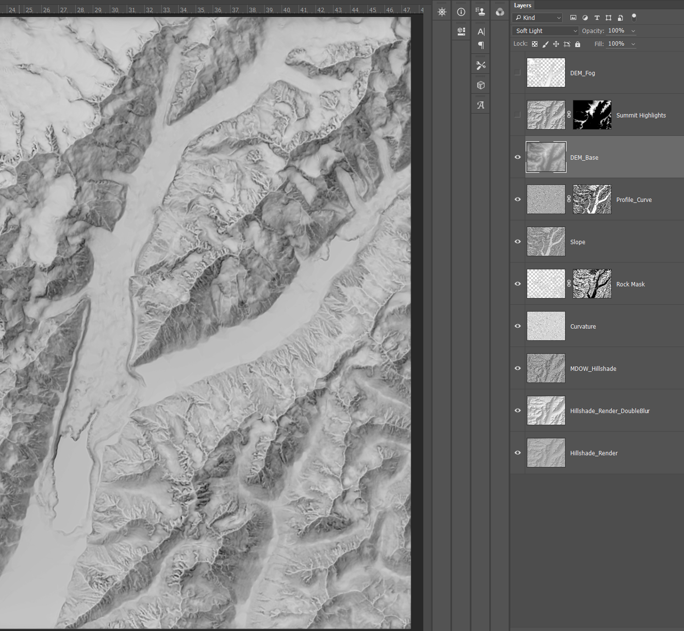
Step 8. DEM Enhancement
Using a DEM can be tricky. Like a slope raster you run the risk of burying flat areas (because often flat = lower) in darkness. So, for my current maps I always heavily lower the DEM contrast before I overlay it. This gives the sense of elevation without drowning any of the map out.
Step 9. Hillshade Summit Highlighting
A extra hillshade masked to just the mountaintops does wonders for popping out the highest parts of the map. Like the last map, I use a intentionally ultra-high contrast hillshade for this. Just as a map is always trying to imitate the realism of the curved (not flat) earth, shaded relief is trying to capture the depth of real terrain in a flat medium.
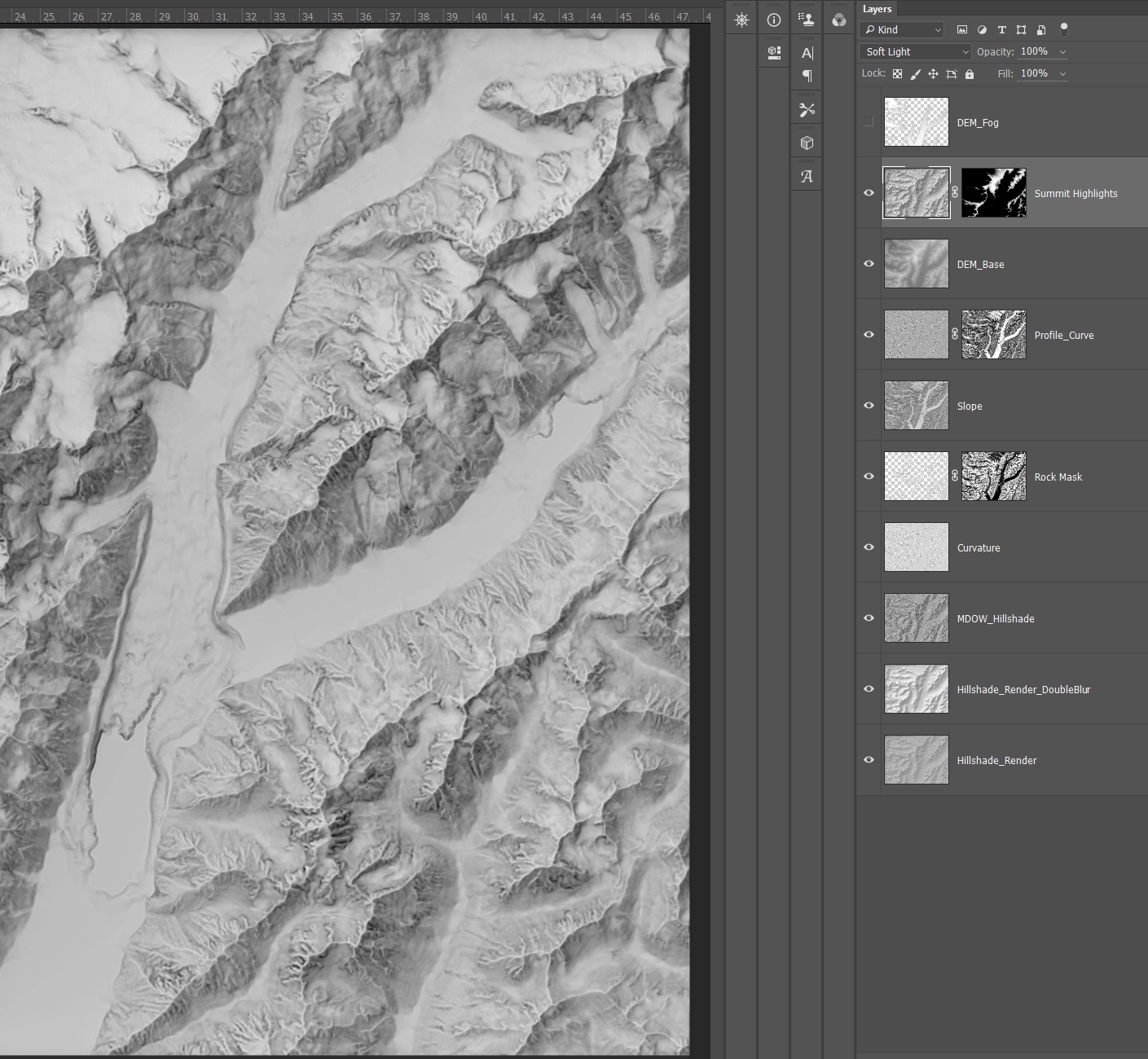
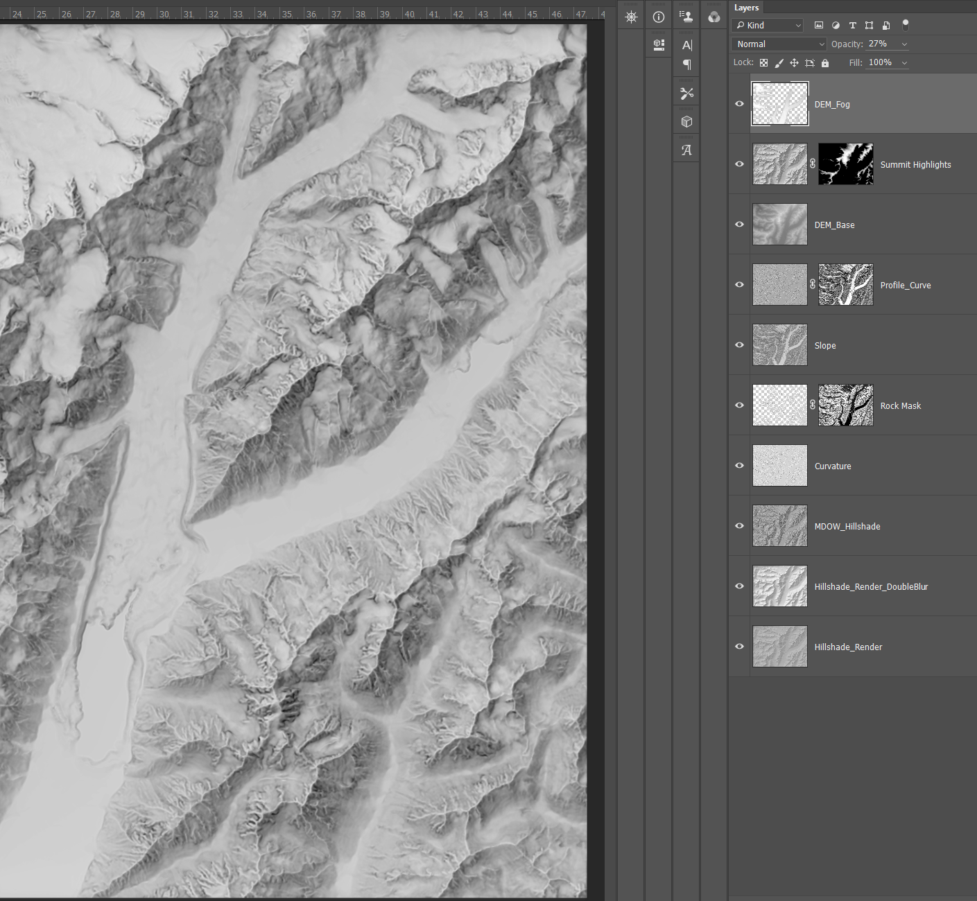
Step 10. Low Elevation Lightening
A final touch: adding a inverted DEM to do a slight fog effect. I was turned onto this idea by John Nelson (read his tips on doing this in ArcGIS Pro here) and just copied it in Photoshop.
Color
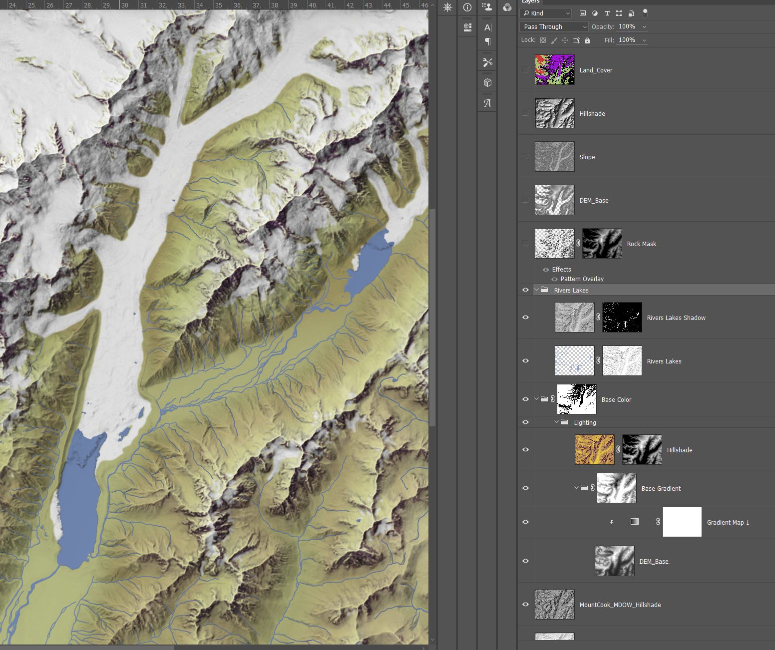
This is where the map takes a left turn from the Imhof style. First, I am not using the color mask property as much, instead mixing in some more conventional layering. I also am pulling in that land cover data from before to add natural colors to convey ice, forest, grass, bare rock, etc. Because the land cover data is flat shapes, I want to blend it with the colors of the relief while still preserving the way light is hitting the terrain.
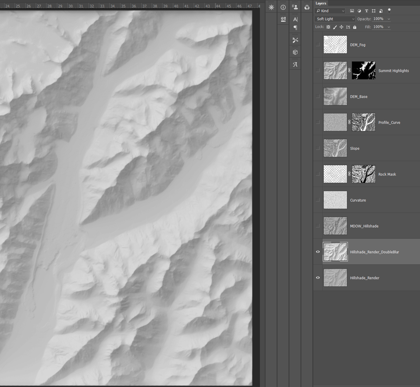
Step 1. Relief Enhancements
Between each seperate map document, I like to revisit the last step and any quick tweaks that strike me in the moment. Maps always look different in the next morning than 2 AM.
Here I doubled up the MDOW hillshade with the base hillshade to pop some of the shadows a bit more.
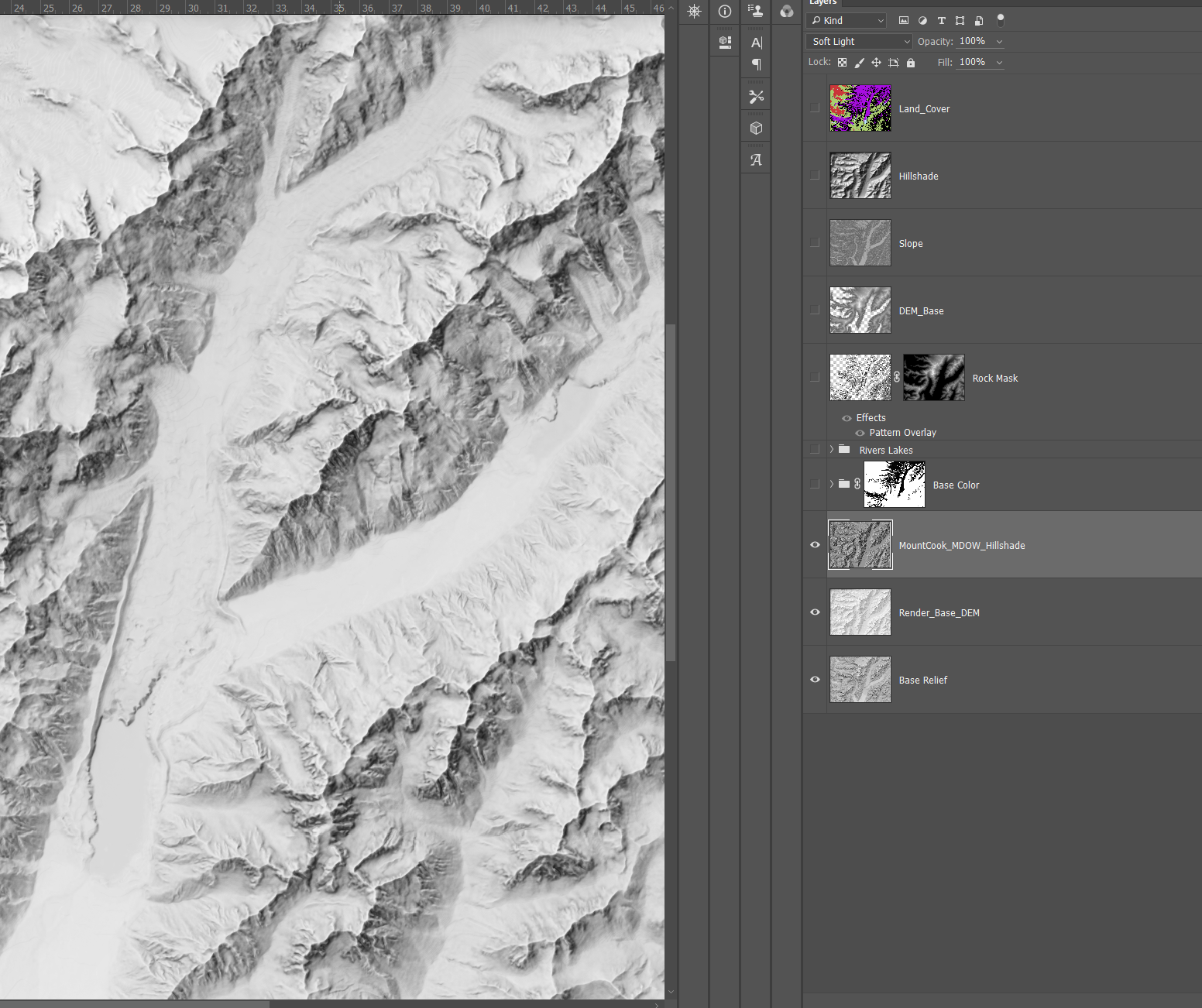
Step 2. Base Coloring
Coloring this map was a great challenge. I eventually settled on using a gradient applied to a DEM instead of flat masked panes of color like the last map. I was going for a different visual style after all, one that was more painterly. The gradient itself is simple:

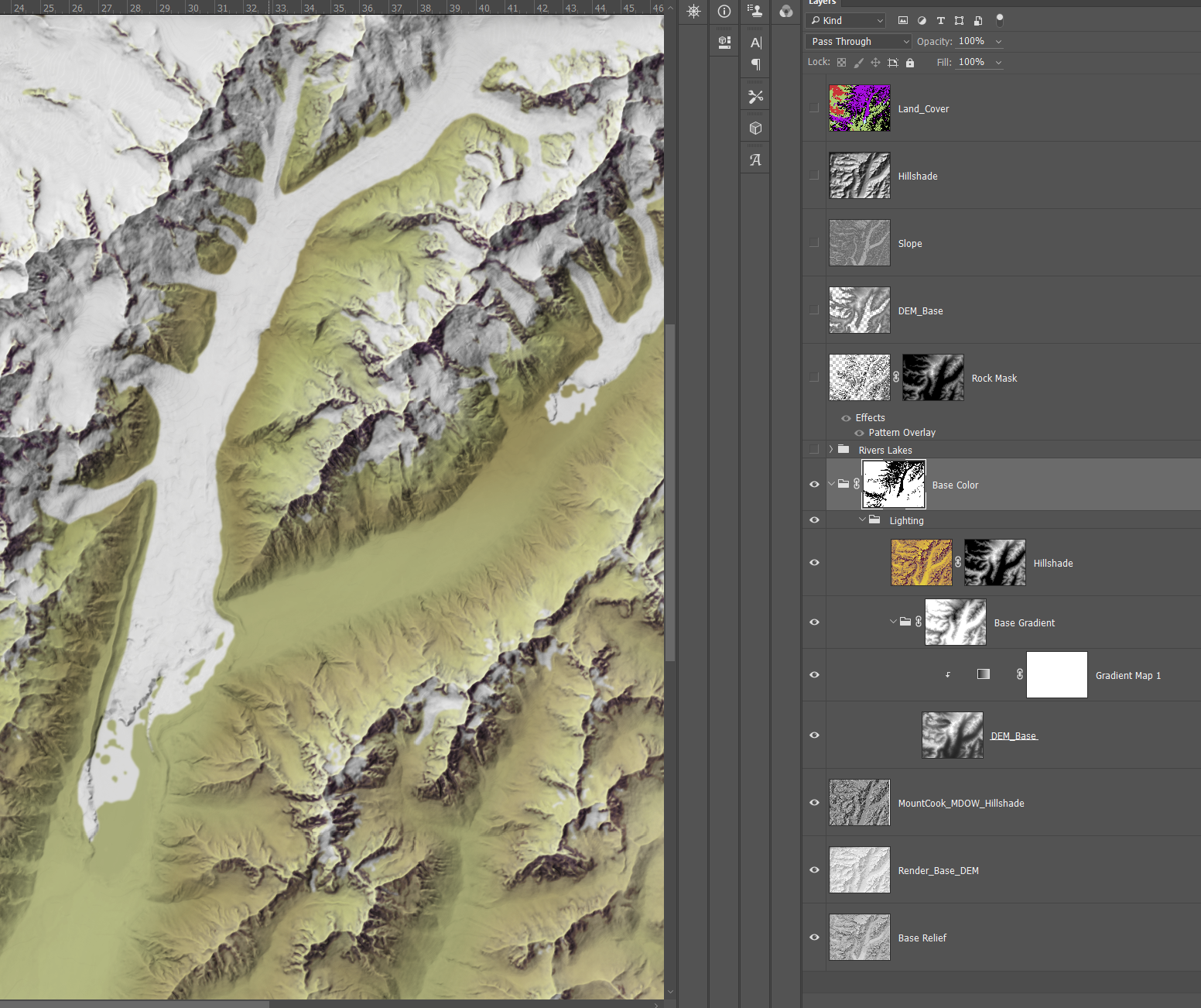
However, I immediately ran into the issue of ice. Ice is hard to map, because it needs to be very bright but not overpowering, and without losing depth. If done right though, it can add a lot of visual complexity to a map while still being soothing on the eyes.
I took land cover data on ice and snow, and used that to mask out the DEM gradient to areas outside the ice. This let the original grey relief shine through with a nice sharp cut to vegetation on the edges. This also meant I could modify the colors of the gradient without accidentially moving the sliders and coloring over a glacier.
Step 3. Waterbodies
Glaciers move. Many of the glaciers in the Aoraki / Mount Cook area are shrinking, and these leave glacial pools at their bases that often are not updated in the GIS data covering these regions. Data will never perfectly reflect reality – Alfred Korzybski, The word is not the thing. A map is a picture that is attempting to represent something else. For this map I included the best data avaliable, and when data conflicted (some land cover classified as ice overlapped with waterbody polygons), I made my best judgement.
One thing worth mentioning with waterbodies is that they can be tricky to blend into a relief. You can get this impression of blue lines cutting over a dark slope or a bright, sunny, valley with no change in color. Areas in shadow, should be darker, and this goes also for features over the actual terrain.
To deal with this, I copied a hillshade layer, blended it with the multiply option over my relief, and then masked it so it only appeared where water was. This gave a effect where water was darker where the hillshade showed shadow – and vice-versa. I also made sure to mask out the water from my DEM base color gradient, so I did not get any ugly unexpected color blending. Just shades of blue.
I ran into a second problem with waterbodies however. The data was excellent, it had dozens of small streams dotting the landscape, but those streams can be a pain to blend in. Many were coming down from steep slopes and then draining into the flat valleys. So, to mimic the idea of water gathering in larger and larger gulleys I masked the entire folder containing the previous two waterbody layers with a inverted slope layer, so water only appears most on flat valleys and seems to blend into steeper areas.
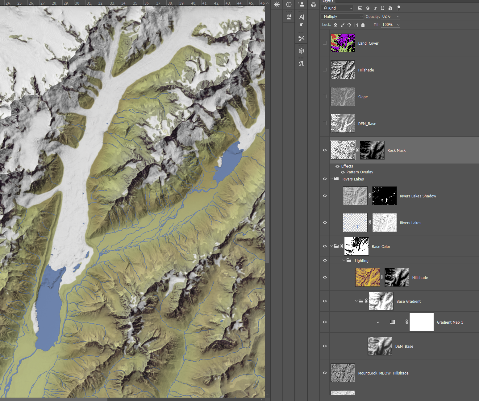
Step 4. Rock Masking
Like I did with my greyscale relief, I highlighted bare rock specifically. This time, with a second curvature raster, colored grey, and then masked with a DEM. This made the grey fizzle out as the terrain went lower, and became strongest at the highest alpine peaks. The contrast between a bare, almost blue, grey and stark white gives a relief the actual sense of mountains, not just bumps on the landscape.
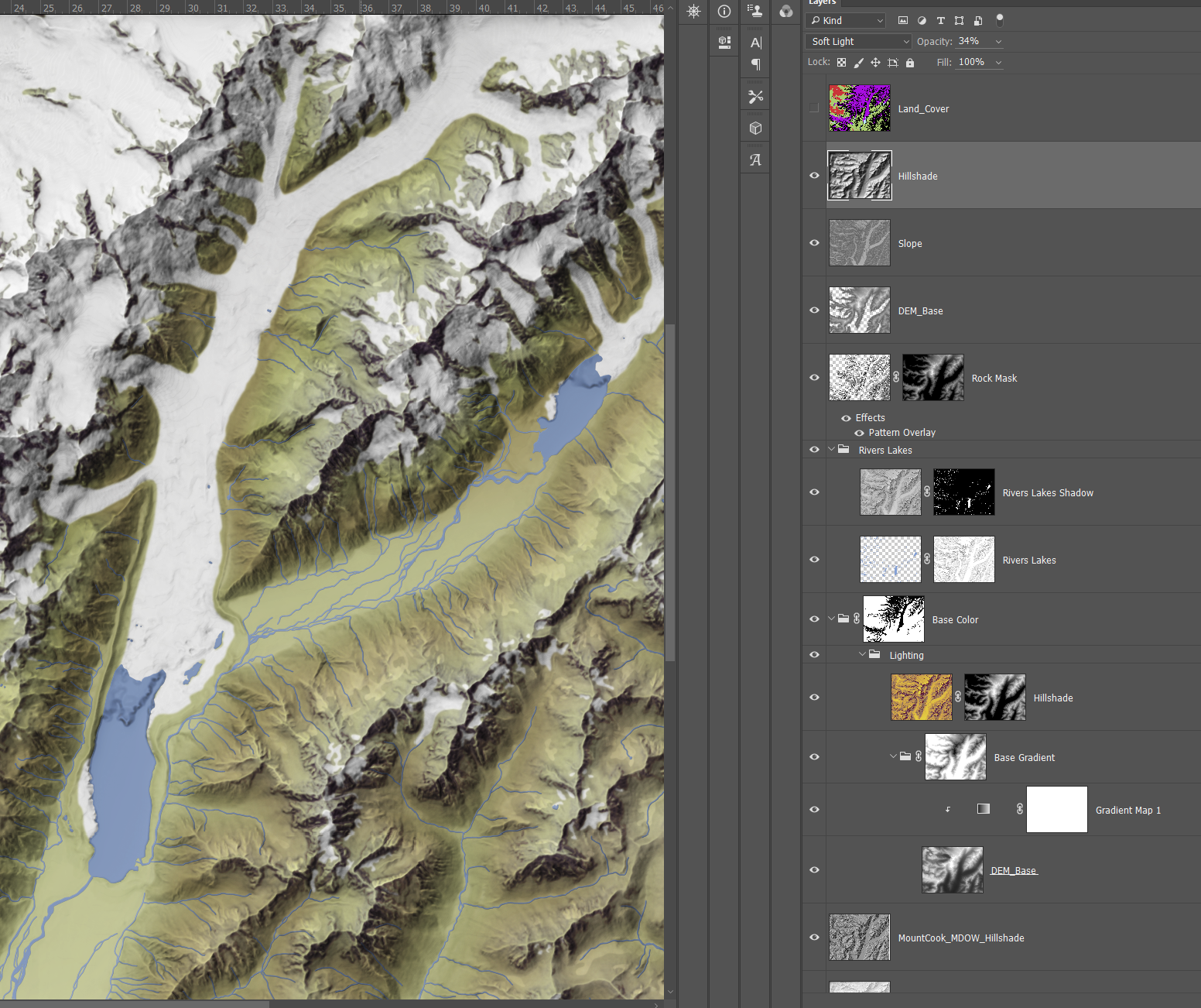
Step 5. Relief Enhancements
I dropped in a few layers on top of all the colors, giving lighting consistently over everything to make sure it all blended together. No element should look like it just ‘sits’ over everything else.
Features and Labelling
Unlike my last map, I wanted to try out using ArcGIS Pro to label for me. Between that map and this one I gained more experience with labelling and felt confident enough in my abilities with Pro to give it a shot. This area also had less labels to begin with, so there was more room for error.
Step 1. Features
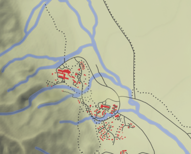
Aoraki / Mount Cook is almost completely undeveloped. It has one town (of the same name), and less than a handful of roads. Adding features was easy. I took roads and buildings from NZ LINZ, and kept the buildings red as my last map, but colored roads black to avoid confusion with the ice dotted all over (which my last map fortunately lacked).
Step 3. Labelling
ArcGIS Pro is a powerful labelling software. I have frankly underestimated it. So much of its power is directly related to what sort of data it is working with. I was fortunate to be working with great data.
New Zealand provides a full gazeteer with points, lines, and polygons specifically to hold labels. It was as simple as tweaking formatting a bit, it practically mapped itself. It is rarely this easy. I still firmly stand behind manual labelling, because having automated labels this good is the exception – not the norm.
The only hard question then, was font. Font can itself make or break a map. There is a degree of snobbery to it, because on its face it is so minor. Font adds to the character of a map, makes it useful, makes it artistic. I always try to choose fonts that correspond first to the theme of the map, and then decide how to break them up to capture different types of features (water, terrain, settlements etc.). This map uses the excellent DM Serif font. It gives a old-fashioned, but still crisp look. You can download it (free) here.
To make sure fonts did not overlap with any other features that might make them hard to read, once I was finished with all font movement I copied it to a new layer, added a thick outline, and then masked that over a heavily blurred version of the rest of the map itself. I was inspired by Daniel Huffmans post here.
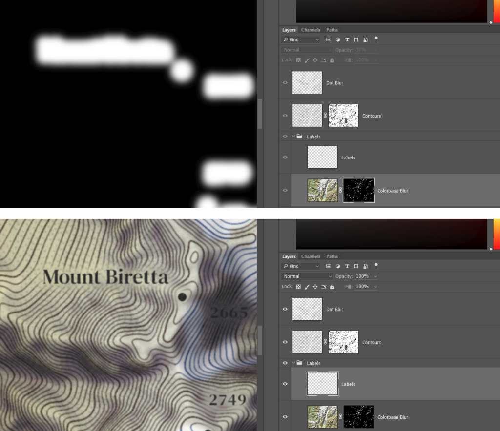
To break this down, what you are doing is copying your entire map without labels, heavily blurring it, and then only showing that blurred map in the areas just adjacent to your fonts. By adding a outline, you ensure that the mask includes a fuzzy area around the font rather than just underneath the letters themselves.
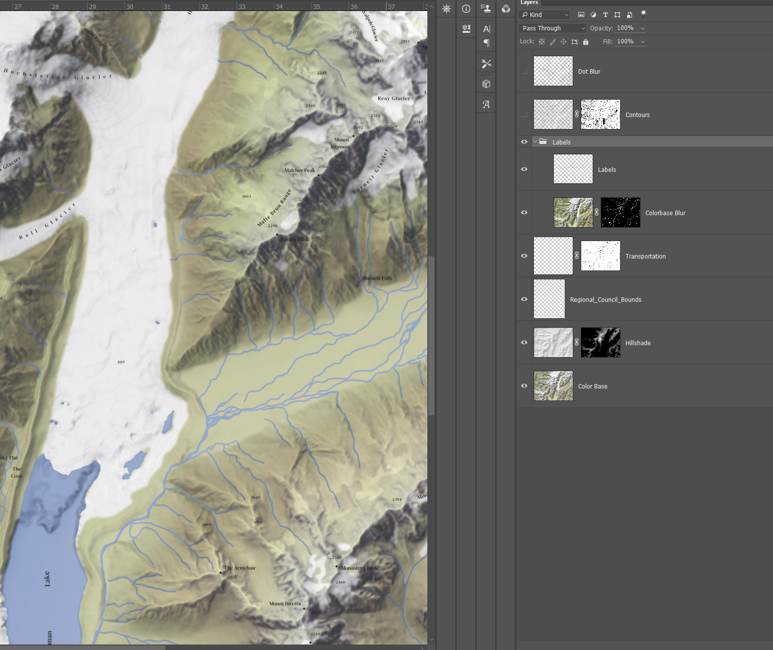
Step 4. Contours and Scree
Contours are appealing and useful. I like to have both unlabelled contours and elevation points. The simple shape of contours gives a impression of the lands contours while elevation points give good quick references for actual elevation. In this case, I generated my own contours from a smoothed DEM and then applied NZ LINZ provided elevation points over it.
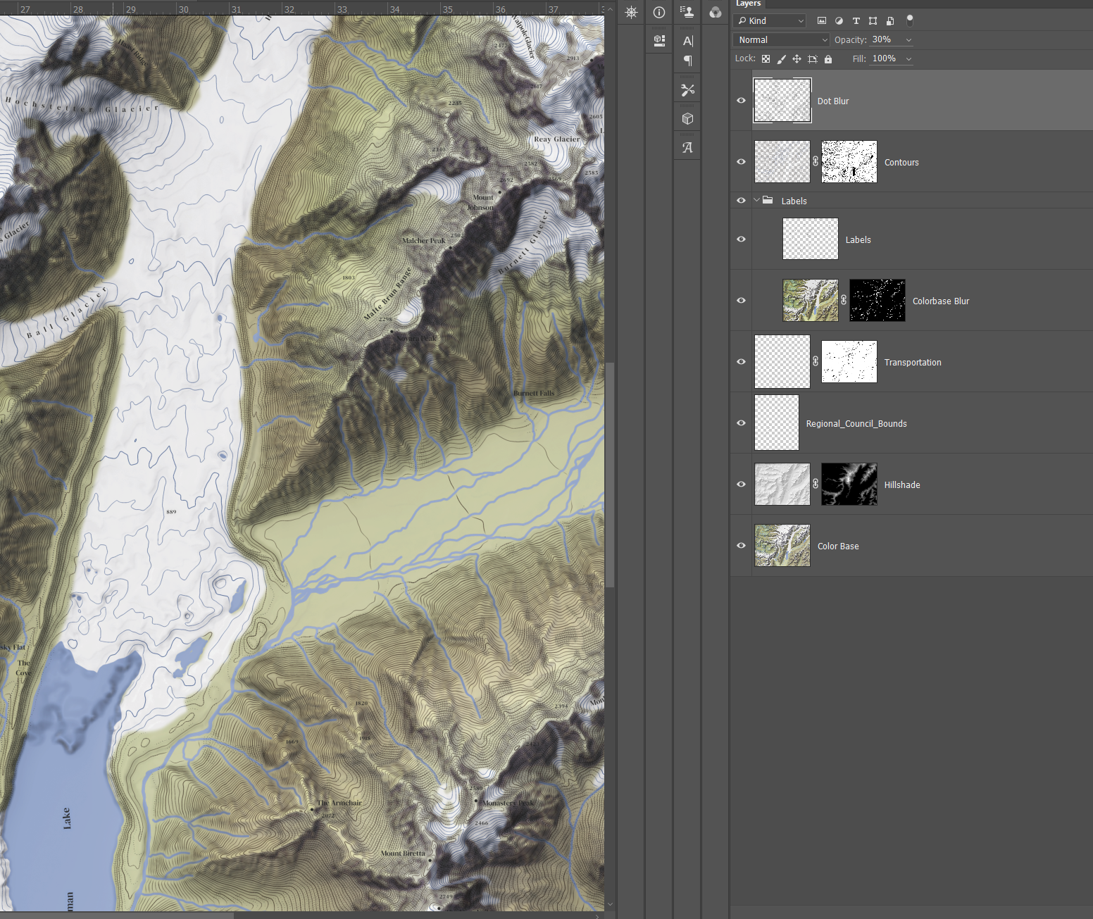
I wanted to add something more experimental to this map. To further highlight bare rock, I decided to try with generating scree. Scree is artifical lines and dots to simulate rockfaces. Digital scree generation can get very complicated, but for my purpose a few dots in the right places was good enough. Terrain Tools includes a tool called Historic Dots that is for this exact purpose. It takes a DEM and places contours that have a automatic dot symbology applied. I just clipped those with the bare rock values extracted from my land cover data, exported it to Photoshop and blended it in.
Final Touches
Once I was satisfied with everything I dropped it onto a simple light-yellow background, added in my legend and text and called it a day. The only thing I have to say here is when writing the descriptive text I tried to be as conscious as possible of the duel Māori and English names for the mountain.
There are also duel histories. I wanted to mention both the Māori beliefs around the mountain and the root of its English name, and the mountains relevancy in the modern nation of New Zealand. As geographers, we have to remember that the same places can mean completely different things to different groups, and that those groups can have sometimes deep pain attached to those places. As part of recognizing the meaning of place in human cultures, we have to consider every culture in that place, not just the most recent one.
Check out the finished map here:
Data Sources
Elevation
https://data.linz.govt.nz/layer/51768-nz-8m-digital-elevation-model-2012/
Land Cover
https://lris.scinfo.org.nz/layer/48423-lcdb-v41-land-cover-database-version-41-mainland-new-zealand/
Waterbodies
https://data.linz.govt.nz/data/category/topographic/nz-topo-50-data/hydrography/
Features
https://data.linz.govt.nz/data/category/topographic/nz-topo-50-data/structures/
https://data.linz.govt.nz/data/category/topographic/nz-topo-50-data/transport/
Gazeteer
Your tutorials/maps are world-class, man. It would be so helpful if you could create a YouTube tutorial detailing your shaded relief Photoshop workflow. Granted, you go into a lot of detail regarding Photoshop in this tutorial, nonetheless, I’m still getting lost with the interplay of all the layers and masks. Hey, I guess it doesn’t hurt ask. Have a good one.