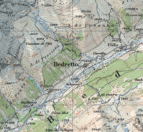
In cartography, the Swiss reign supreme. Swiss-style cartography is recognized globally as the standard to match for detail, beauty, and pedigree. Of course, this means everyone else wants to figure out what makes this style work. One of the first Swiss masters was Eduard Imhof ( 25 January 1895 – 27 April 1986 ) , a former surveyor who produced some of the finest maps of the 20th century.

Nowadays, it is easier than ever to make a shaded relief. Detailed DEMs (Digital Elevation Models) exist for thousands of miles of the earths surface. However, what sets older reliefs apart is that lack of detail. The human eye sees a landscape very differently from how it actually appears, and a computer-generated DEM will capture how it actually appears, and not necessarily for the better. This will become clearer deeper into the tutorial.
This tutorial showcases a quick, 1 week test, I made of some terrain digitally to try out some different techniques. I believe, that if you can automate the production of a image that once required manual labor, than you understand the fundamental patterns that make that manually produced image so desirable. So, lets begin.
Goals
Before any project one should consider the end goal. Here, my goal was create digitally a map that could be plausibly passed off as a manual relief. To capture the forms, colors, and composition of a vintage Imhof style piece.
Software
I work exclusively in ESRI ArcGIS Pro and Photoshop. I use Pro to prepare data, and Photoshop to finish. For raster work, I use Photoshop much more because I have more control over combining the various layers to make the end product. The fundamental principles however, would apply in any similar program. (such as GIMP or QGIS).
Data
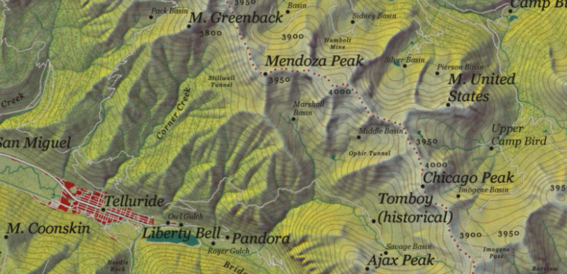
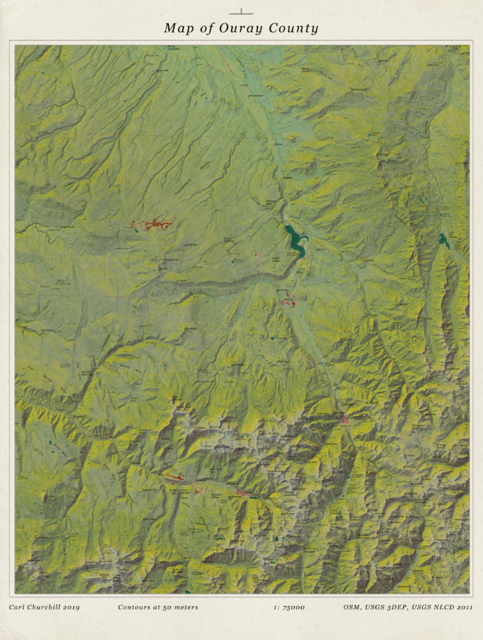
Make the map to fit the data. For this project I needed to get elevation data for a rugged area somewhat like the Swiss Alps (I have actually spoken to current Swiss cartographers about how Swiss mapping techniques work in say, deserts, and have been told it has not met much success). I am shamelessly a Colorado native, and immediately decided to map Ouray county, the so-called ‘Switzerland of Colorado’.
The best source for elevation data in the US is the USGS 3DEP Program. It provides quality 1/3rd arc second DEMs for the entire country with even higher (1 meter) data for certain areas. This resolution roughly comes out to 10 meters. Its also all free.
The land features (roads, towns etc.) all come from Open Street Map, or OSM. OSM is always being updated and in recent years its coverage of the US has expanded significantly. It is in many ways just as accurate and comprehensive (in many countries, more comprehensive) than official national data. It is not perfect, but the OSM coverage of the area I wanted to map was more than good enough for my purposes. Always check that the data covering your target area is good. Bad data makes a bad map.
Because OSM can have gaps, especially for waterbodies, I pulled those from the USGS National Hydrographic Dataset, or NHD. For some vegetation and urban areas I used the National Land Cover Database (NLCD).
For placenames and feature names, I used the official GNIS gazeeteer, which records all official placenames in the United States. Lastly, I downloaded some census shapefiles for county boundaries and town boundaries (though I ended up not using the latter).
Preparation
Once everything is downloaded and neatly stowed away in a Pro project (also note the SwissTopo and IMhof folders to stash some convenient reference maps):
First step was some basic housecleaning. I projected everything into NAD 1983 StatePlane Colorado South. The exact projection is not terribly important for this sort of project, but taking the extra five minutes to choose a appropriate one is always worth it, just in case.
Next, I made a temporary polygon and clipped my DEM to a more managable area. I created a layout (30 x 36 inches) and made sure it contained the entire boundary of Ouray county (and a bit of breathing room on the edges). Then I could prepare the raster data.
There are many ways to tell a computer to read a DEM. A DEM is just a value per pixel according to elevation, but it says nothing about how light would interact with those pixels (a hillshade), how much a pixel changes value compared to the ones around it (slope), how the overall surface changes slope (curvature), and then which way those slopes are pointed (aspect). These are all self-explanatory, except for curvature which I confess – I do not fully understand either. Here is a great tutorial to atleast get you started on the concept.
This is also where I want to touch again on the issue of detail. What looks good to your eyes is different from what actually exists. In art, this is called “drawing what you see vs what you know”. For example, look at this drawing:
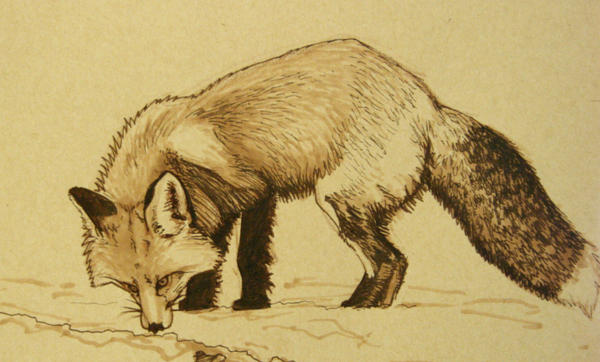
A fox has thousands upon thousands of individual hairs, but to try and draw each of those would make the image look cluttered. Instead, by just drawing enough to let your mind fill in the rest, hitting highlights and shadows, the picture has room to ‘breath’.
The same principle applies to mapping. Trying to use a unsmoothed DEM will make your map look busy. At the same time, its important to preserve detail. I made two copies of my DEM, one original and one smoothed. I used the Focal Statistics tool in ArcPro to smooth it just enough to cut out the really messy details but not lose the actual topography.
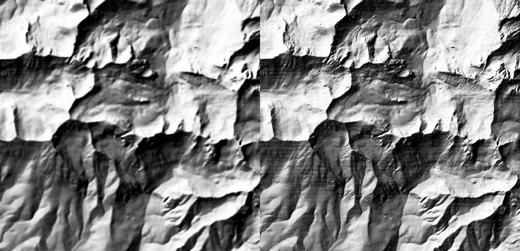
Just in case theres some detail I lose when I smooth the DEM, I run all my raster processes for a blurred and unblurred version. This way I can mix them if I want to pull some specific detail out that I wouldn’t otherwise have.
I generate 7 base rasters from my DEM:
Hillshade, aspect, slope, curvature, plan curvature and profile curvature. plan and profile curvature are slight variations in the way curvature is calculated, but for our purposes the main difference is that profile emphasizes terracing in a landscape while plan emphasizes ridges and valleys.
For this project I also decided to go the extra mile and generate some additional hillshades to round out my toolbox. I used the excellent Terrain Tools ArcGIS Pro toolbox, avaliable here, to generate MDOW and Sky Model hillshades. MDOW just means that the software is hitting the DEM with light from multiple angles, unlike a traditional hillshade that only uses one. This emphasizes features that would otherwise be missed. Sky Model essentially does the same process, but uses a simulated real world sky and hits the DEM not just at multiple angles, but with multiple types and intensities of light. All three hillshades work well, but combining them is a great way to add a extra special look to a relief. Also, because cartographers working manually would frequently alter the light angle locally to highlight a particular feature, these two extra hillshades let you get closer to the look they achieved.
I export all of these as 300 dpi .tif greyscale files. I have taken to working exclusively in greyscale when building the base terrain as it forces me to think about the terrain features exclusively. At this stage, I treat color as a crutch. I only introduce color once I am totally satisfied that I have captured the landscape properly in grey.
Making the Relief
The shaded relief is the real meat of the project. One needs to be truthful to the subject matter, to accurately capture it, while making a appealing product. In many ways, making terrain is like portraiture. You need to render the subject better than reality, without losing its identity. What this abstract gibberish translate to, is making sure you capture three fundamental aspects of a landscape: Height, Form, and Detail. So, you need to work on each aspect in different ways with your prepared rasters.
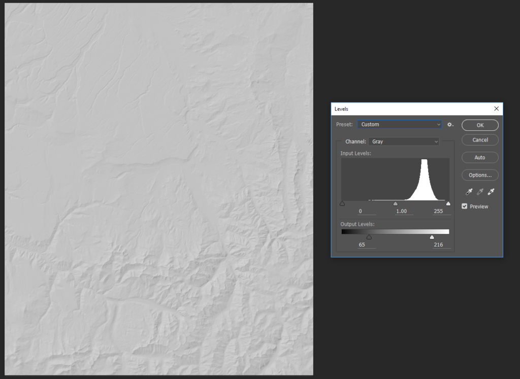
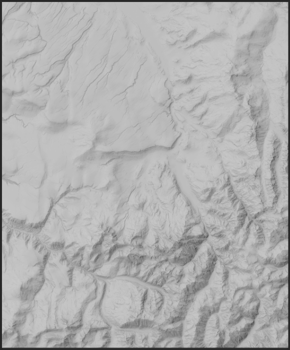
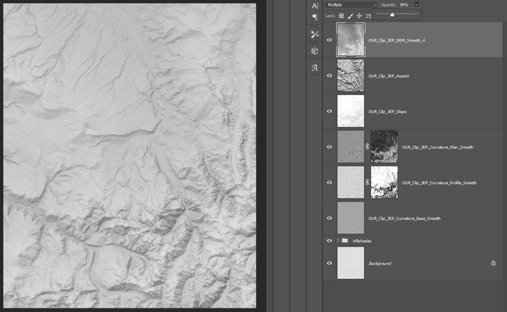
I always start with form. The basic contours of the landscape. Where the land is rugged, where it is smooth. I lay down my hillshade in Photoshop and tweak it just slightly with the level tool to reduce the extremes. Its very easy to end up with what I call a ‘burned’ effect, where you have ugly spots of pitch black shadow in a map.
A quick note. When I refer to the location of a tool in Photoshop, I will label it by all the containing folders in italics like this: (Image/Adjustments/Equalize)
One great trick to pull out the major shapes in terrain is to copy the hillshade, and then use the median tool and then the equalize tool (Image/Adjustments/Equalize) with a heavy (heavy) blur.
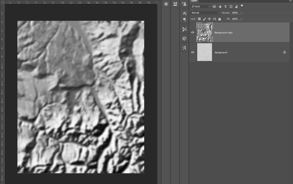
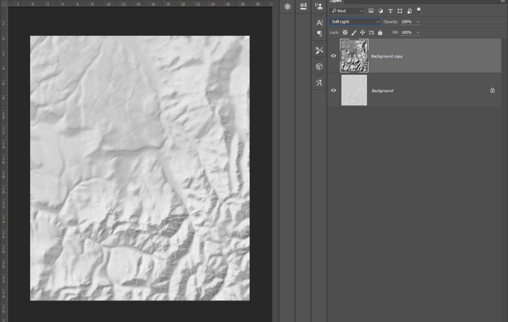
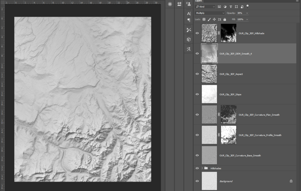
This trick gives the map a better sense of large-scale form than just using the small-scale hillshade. Next, I lay on the other hillshades I have prepared, the MDOW and Sky Model ones. I tend to use the multiply blending mode for the Sky Model and soft light for MDOW. Because the MDOW hillshade is darker, I use soft light to still grab details but not over-darken the image. Alternatively, the Sky Model hillshade is very light so I can use multiply to grab all that detail and not worry about making the image too dark. Its a balancing act, and I am always making small tweaks to light and contrast at each step.
Now I move onto detail. For details, I use the curvature rasters. This is also where I introduce layer masks. A mask in Photoshop is a greyscale image attached to a layer that determines that layers transparency per pixel. White is fully opaque, black is fully transparent. Its a great way to modify a layer without actually editing it. You can make a layer mask in photoshop by clicking the small rectangular icon with a circle on it at the bottom of the layer pane.
Because curvature rasters can be heavy on small details, masks let me apply details to areas that need it and hide them for areas that need visual space to breath.
One great trick I learned from reading Tom Pattersons articles was to use the slope raster as a layer mask for a curvature raster. Here, I applied the slope raster to the mask (alt+click to access the mask):
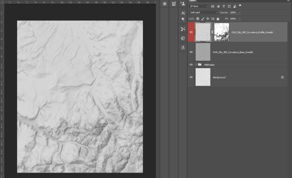
This means dark areas correspond to steep terrain, and the curvature raster is more transparent there. Because steep areas are tight and rugged, adding extra detail would just be overwhelming. Here, I applied the base curvature raster to the whole hillshade but masked out the profile curvature. Because the profile curvature focuses on terracing, masking it to just areas of lower slope lets me emphasize flatter terrain details without obscuring anything else.
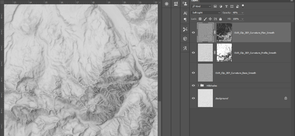
Using the soft light blending mode keeps these details light. One principle of Eduard Imhofs maps was in fact, to keep low-lying areas bright to make them easy to see next to high mountains, not dark and obscured like a DEM might make them out to be.
I do the same step again with the plan curvature, but I reverse the mask. Now I have one curvature raster emphasizing steep areas, and a different one hitting flat areas. This makes a great mix of details that all work together without overlapping.
Past this point, it is just minor touch ups. I add the slope and aspect rasters, and then the DEM to add a sense of height. I lower the contrast on all three, invert slope and aspect (so I have light flat areas and lighter areas to the north respectively) and blend all three with soft light. I use aspect for this map because I have wide flat foothills facing north. Using the aspect raster lets me hit those areas with a lot of light. Because aspect is so dependent on the topography of a area, it should be used seperately on a case by case basis.
There is only one step left, and it is surprisingly important. Like the DEM this relates to conveying height. We have captured form, we have captured detail, but we still need to make the terrain feel well, like terrain. With ups and downs.
One trick swiss cartographers use to make terrain seem more 3d than it actually is, is to vary the level of contrast according to elevation. High mountain peaks have crisp bright white highlights and deep shadows, while lower valleys have milder shades. To accomplish this, I simply make a new hillshade with a extremely high contrast, and mask it with a DEM for elevation while blending it with the underlying image.
I do any final tweaks and save the image as a 300 dps .tif file. One thing to keep in mind is always make the relief lighter than you might think necessary. A light, low-contrast relief helps features show up better than one with more dramatic shadows.
Color
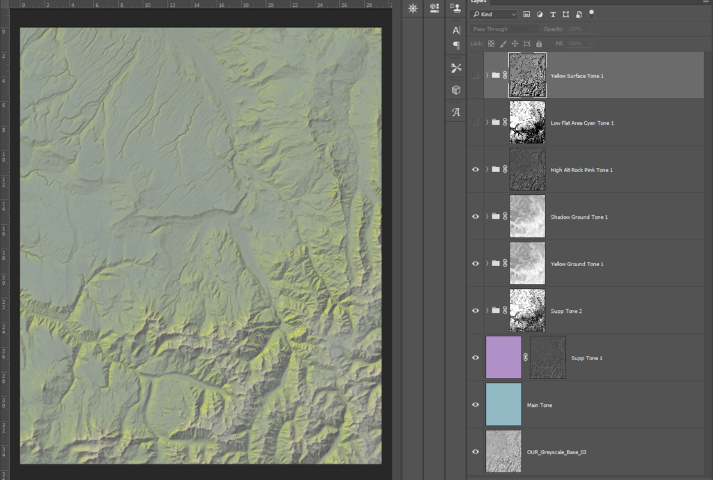
Eduard Imhof developed a unique style of coloring terrain that emphasized blues, greens, and yellows to simulate natural light. He invented a color plate printing process that overlaid six different layers of color masked to different areas that when combined created the final image.
Normally, when I color a map, I use gradients mapped to values in the DEM and blend this into the greyscale relief. That did not work here, so I tried a different approach. By making a layer with a flat single color, and then masking it according to different aspects of the terrain I could mirror Imhofs color plate style and prevent overtly digital looking color blending, like you can see if you use a gradient.
What Imhof is doing here is using blues and greens for the base shades, yellows for sunlight, violets and blues for shadows, and then light pinks and whites for peaks and bright highlights.
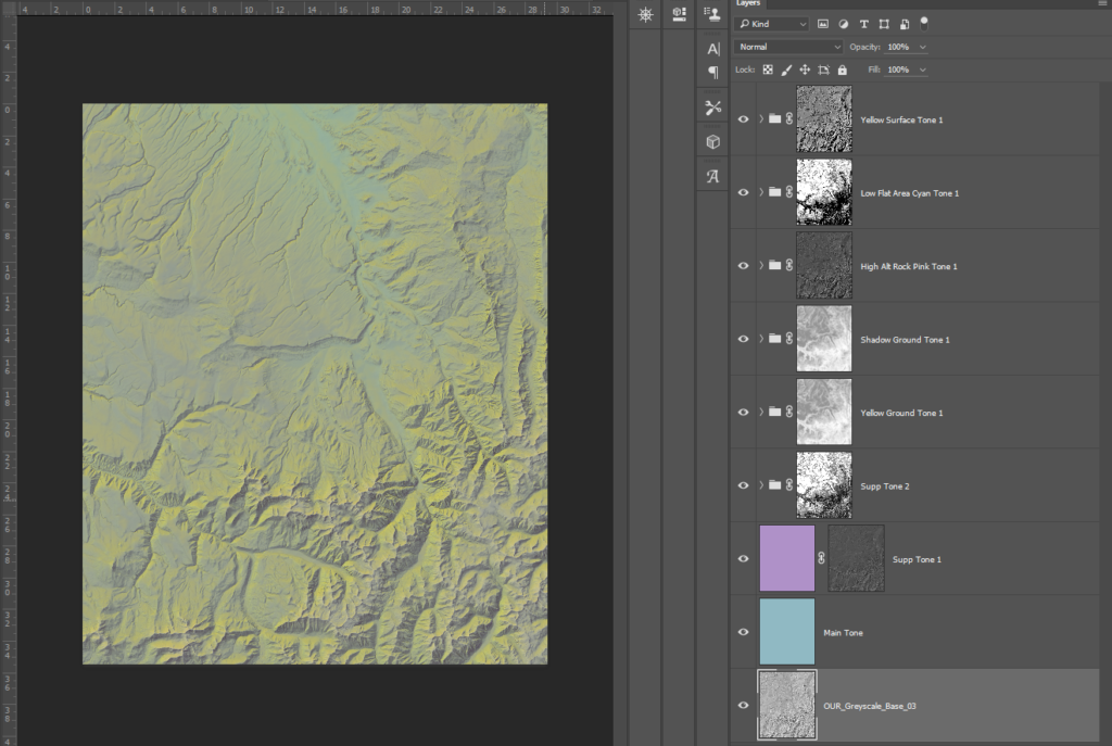
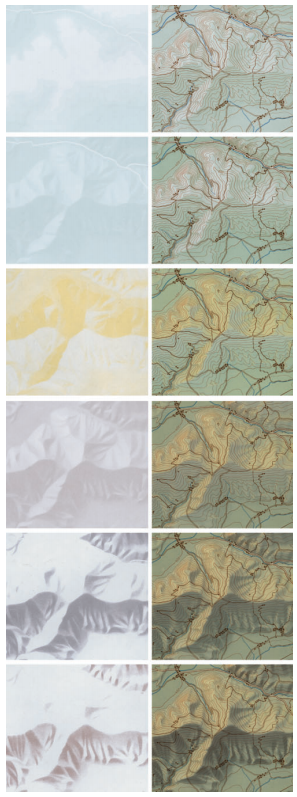
This image is a bit intimidating, so lets break it down. Also, I made some color decisions that in retrospect, I would not do again, but I am still proud of the process. I will pay more focus to that than specific color choices.
Step 1. Base tone. I use the multiply blending mode for a nice even shade.
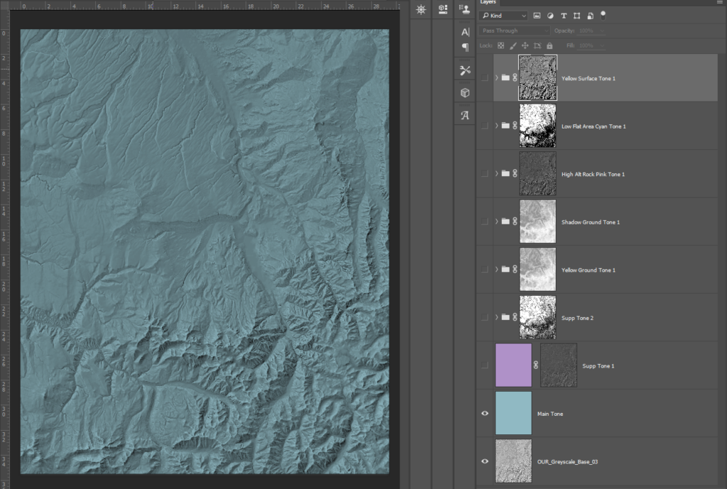
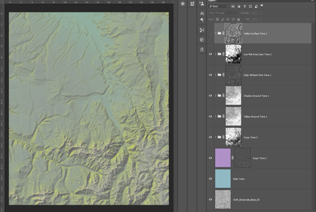
Step 2. A violet tone just in shadows (I used a hillshade as the layer mask).
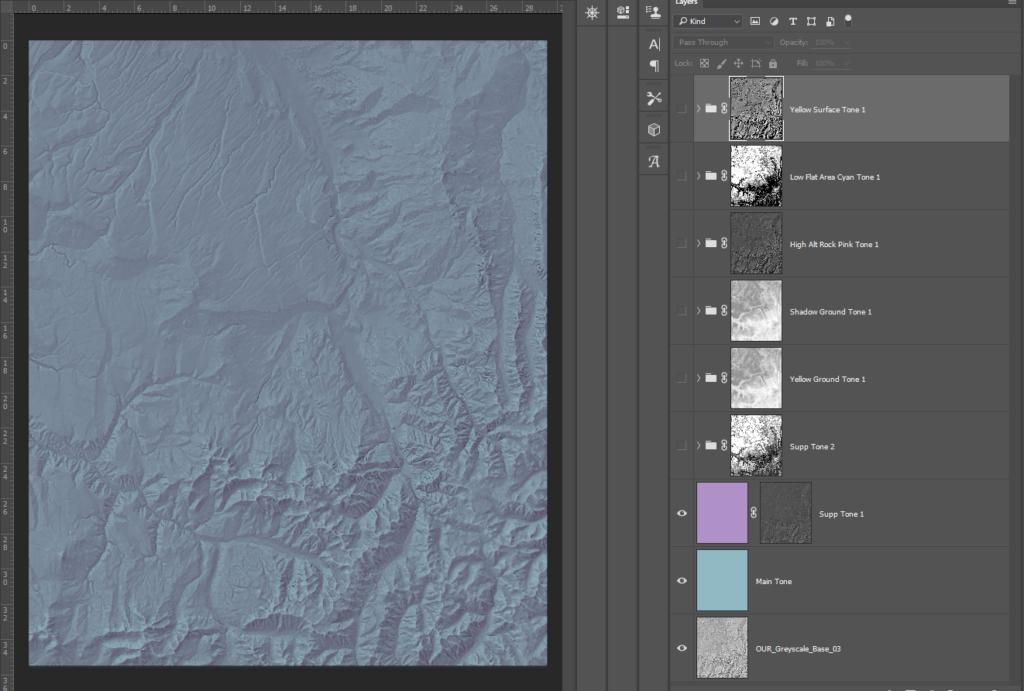
Step 3. A light, washed out blue to start to differentiate high and low altitude areas. I masked this first with a hillshade, and then with slope (you can apply multiple masks by masking the group a layer is in). This way the light blue only hits sunward slopes at low-mid elevation.
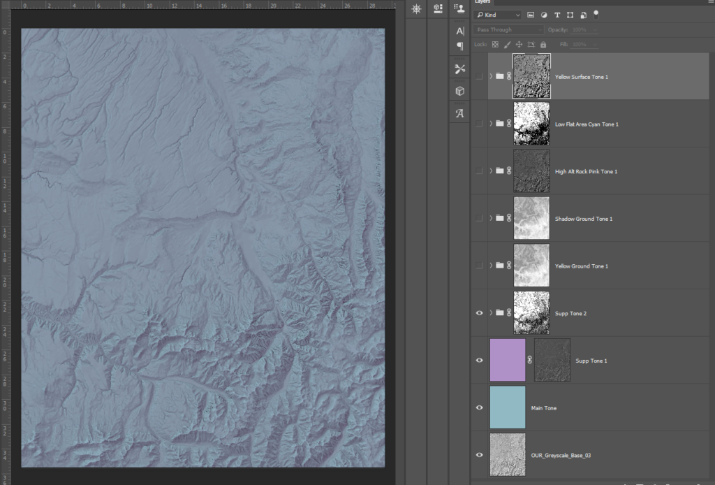
Step 4. I lay down a greenish yellow to mimic sunlight. I use both a hillshade and DEM again, but this time I am masking out shadows so the yellow just hits sunward slopes, and I am masking out low elevation areas so it hits peaks more intensely.

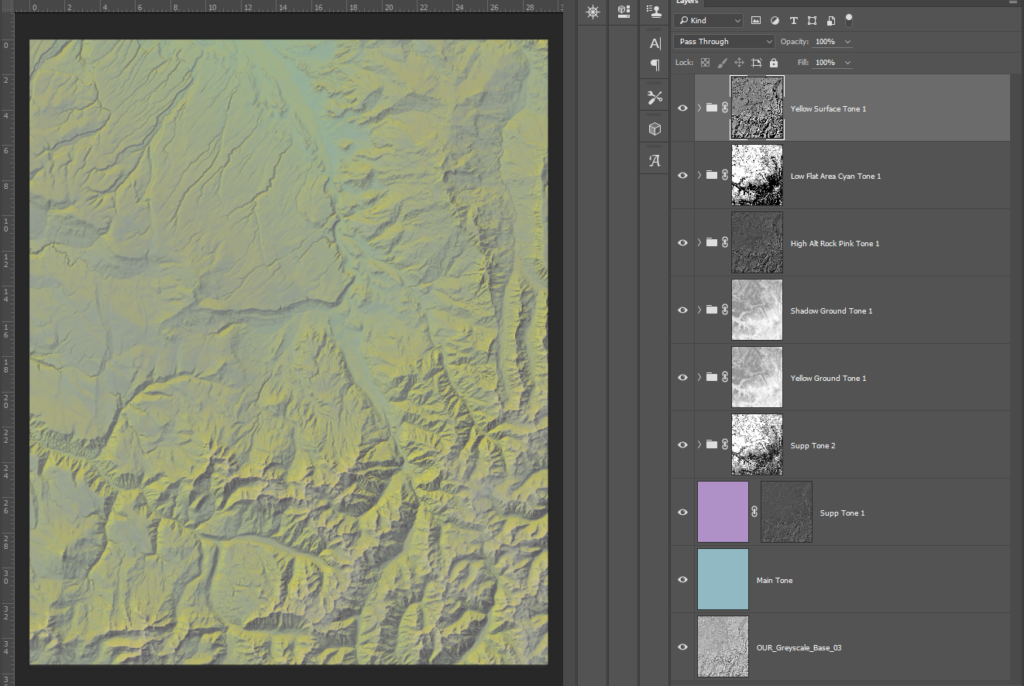
Step 5. I darken high mountain shadows using the exact same layer masking as Step 4, but I reverse the hillshade mask.
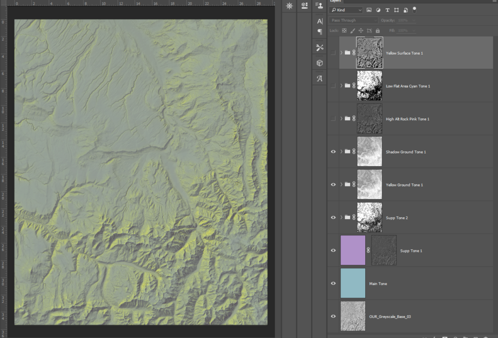
Step 6. I use a light pink to just hit the mountain tops. This is a DEM and hillshade mask, with the DEM set to just expose the very highest altitudes.
Step 7. I add a light blue to the lowest altitude areas to prevent them from getting washed out, and add a sense of atmospheric haze, like a morning fog.
Step 8. I thought the map was getting too blue so I added a yellow tone to low altitude, flat areas with a DEM and slope mask.
The only thing I changed past this point was increasing the brightness and upping the contrast just a bit. Otherwise, I was worried the map would be just a bit too washed out. However, ultimately its a matter of taste. Part of the charm of many old maps is how the colors arent perfect. Sometimes the blending is too sharp or too subtle. It gives a sense of being painted, and not generated.
Features and Labelling
I like to automate as much as possible, but I also know when to pick my battles. I have yet to find a satisfactory way to label automatically. There is simply no substitute for doing it yourself. Features are a bit easier.
Land cover is a tricky subject. Many maps like to show which areas are forested and which aren’t, but even unlike modern swiss maps that clearly identify greenery:
Imhof often preferred to allude to it through shading:
I compromised and only used the NLCD forest cover to give texture to densely forested areas. I added noise, blurred it, and overlaid it so it had a speckly feeling to mimic the individual clumps of trees:
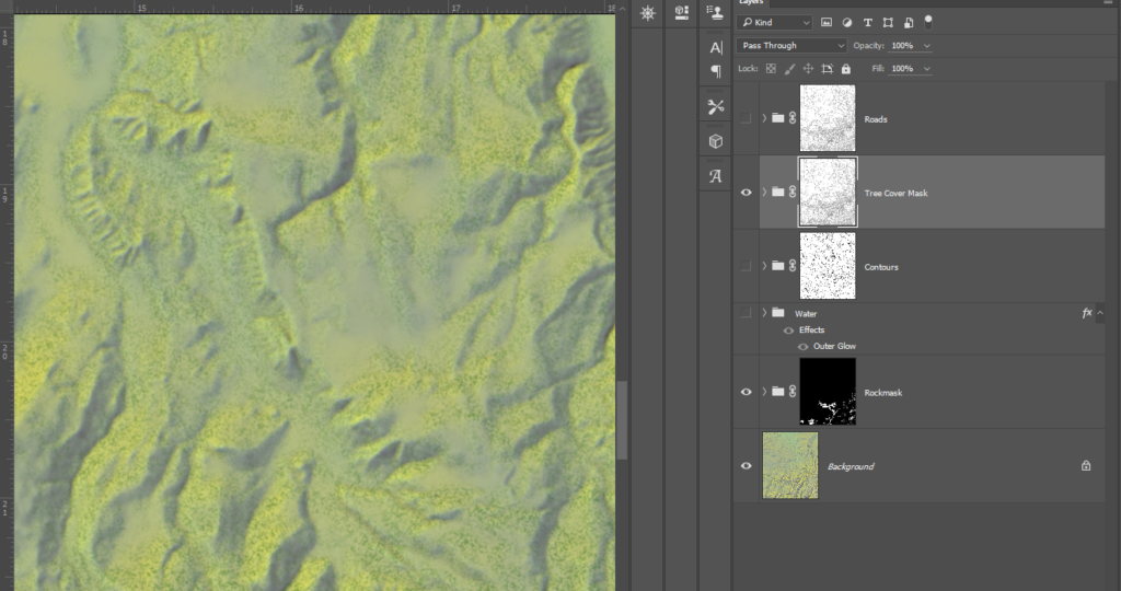
I took the chance also to add a bit of white (the Rockmask layer) to bare mountain peaks. Then I added in waterbodies and contours, using them both as masks for the tree cover so trees don’t end up obscuring these features.
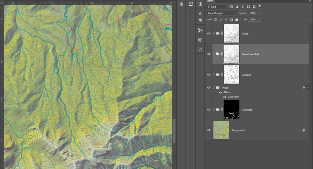
Using the OSM data on roads, and the NHD data on rivers, I laid them down and colored them to match some of Imhofs maps. For both, I made a second layer that was darker and washed out, and then masked it with a hillshade to simulate slight shadows being cast over the feature. This blended them better in darker areas while still being easy to see.
Because these files are so large, I regularily move to new ones to prevent any single one from being too bloated. After adding in water, vegetation and contours I moved to a new file and added in major roads and urban areas:
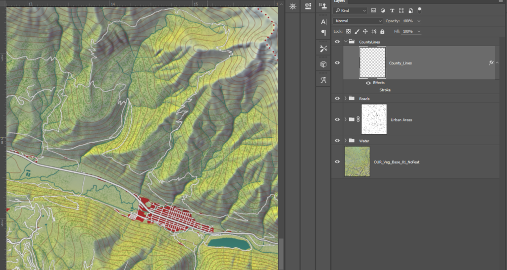
I again used the NLCD to extract urban areas, exported that to Photoshop and used the median tool (Filter/Noise/Median) to smooth out the pixellated edges. I originally was going to map individual buildings, but the map scale is too large, and the data is too patchy.
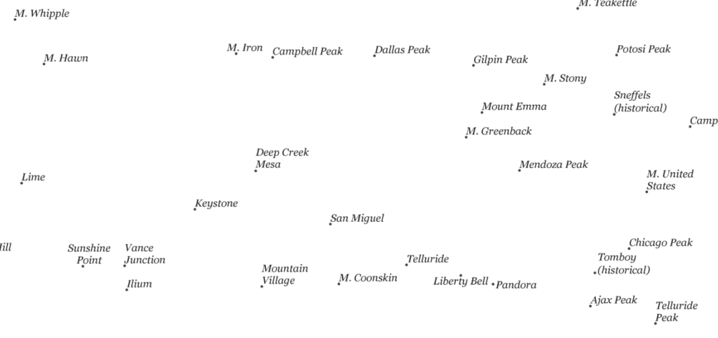
Now labels. Right now, I create point labels in ArcGIS Pro , and then label everything else manually in Photoshop. The GNIS data provides these as points already, so I don’t have to do anything but select font and size.
I have had no issues using Pro to label points, and then I just move them if I need to. I export the labels alone on a white background so I can easily clip it out:
I have heard ESRI has integration options with Illustrator and Photoshop that could potentially make this process easier, but until I get it sorted out I have to stick with this method.
I decided to label rivers and large land features in addition to points. There were lots of small gulches and canyons in the GNIS but they were often missing from US Topo maps, and it was hard to tell which features they belonged too. In addition, many were very small. In this case, I used my best judgement to label larger canyons and gulches as curves, and for the small ones I left them as points. To add to the vintage feel, I kept all labels black with a serif font.
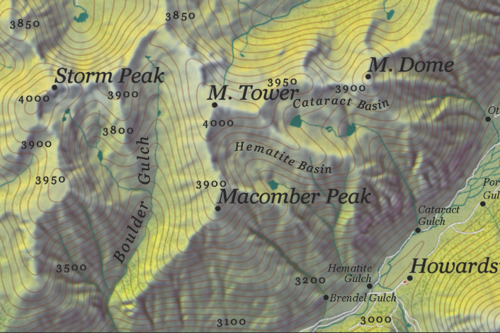
I labeled contours for a better sense of elevation. Contours are a great way to add meaningful detail to a map and improve it artistically. The main thing to be aware of is to keep them smooth, and know they aren’t going to work great in steep areas.
I also decided not to label certain features, like roads. I also left a lot of small locales (campgrounds for one) off the map. They cluttered it, and felt pointless. Once I was satisfied labelling, I moved onto the QA state.
Final Touches
It is crucial to check your work for mistakes. Even if you don’t catch them all, you will catch something. I developed my own way of checking my maps by breaking them up into a grid and examining each piece at a time:
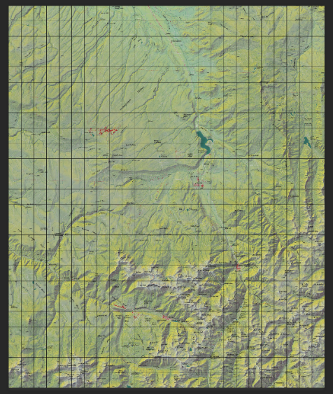
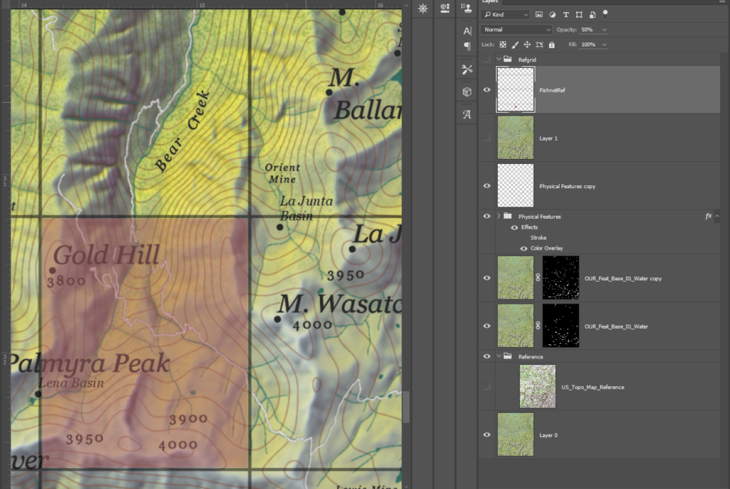
Once a section is done, I fill it in and continue till the whole map has been checked. I then do a few passes over it without the grid. Looking at it from a large and a small-scale view helps capture different things.
I then export the whole thing, and add a bit of noise and a little blur. This brings all the map elements together with a lovely vintage touch. For this map I even added the slightest overlay of a weathered paper texture. How you do the legend, title and outside canvas is entirely subjective. I wanted to showcase the terrain as if it was a study, so I did not do a involved elaborate layout.
In retrospect, I learned a lot. This map is meant as a test for a larger more involved piece. I plan on applying the successes from this to that, and learning from my missteps. Every map is a learning process. Theres something to be gained from everytime you create. I hope this tutorial helps you learn some interesting tricks, and inspires you to try your hand at it yourself.
Data Sources
Elevation
https://viewer.nationalmap.gov/basic/
Land Cover
https://www.mrlc.gov/data/nlcd-2016-land-cover-conus
Waterbodies
https://viewer.nationalmap.gov/basic/?basemap=b1&category=nhd&title=NHD%20View#startUp
Features
http://www.geofabrik.de/data/download.html
https://www.usgs.gov/core-science-systems/ngp/board-on-geographic-names/download-gnis-data
Citations
Jenny, B., & Hurni, L. (2006). Swiss-Style Colour Relief Shading Modulated by Elevationand by Exposure to Illumination. The Cartographic Journal, 43(3), 198-207. doi:10.1179/000870406×158164